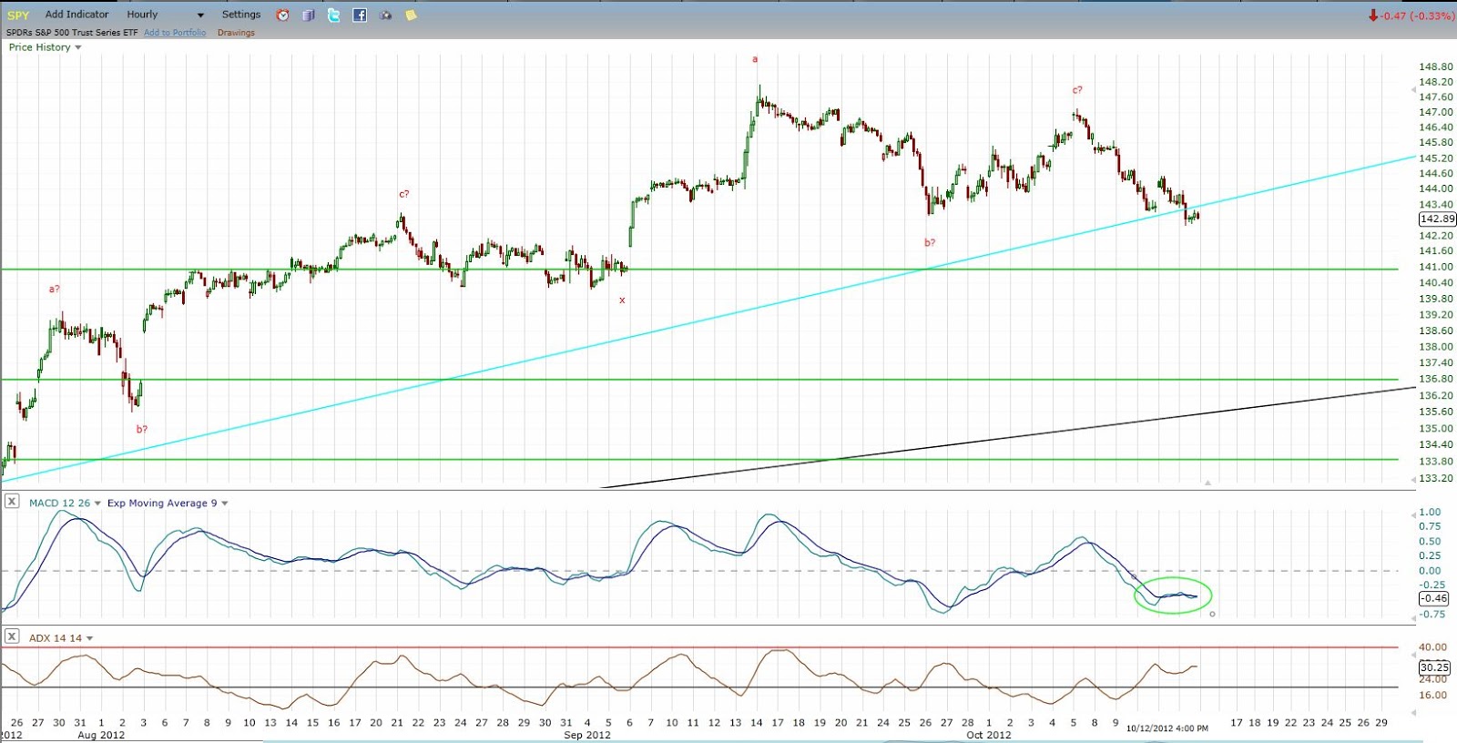
There is much folly I think in creating market forecasts, yet many traders and market analysts continue to do so. I think a good market analyst is actually behaving in a scientific manner by making a forecast. Essentially they have a theory or hypothesis of market movement and so they create an expectation based on that hypothesis. I think that is excellent for building confidence in market analysis and trading decisions. But the idea of objective confirming price action is a critical component as well, and if you follow any consistently good market timers or traders who make forecasts, they basically all have criteria that help to confirm the unfolding of a forecast or that quickly call a forecast into question. This is precisely why I use price and time criteria for confirmation in conjunction with patterns. It helps to keep somewhat patient in waiting for price to actually do what is expected, but also can still get you in early enough to make good profits. At times I also feel that patterns can be clear enough that they give the opportunity to take calculated risk even before confirmation occurs.
Obviously since that early 2013 time we saw the bull market continue without any major corrections along the way, affirming that indeed the move up in early 2013 was a "breakout" in that it started a new price pattern and phase of market psychology to the upside.
Now at this point it appears from technical analysis and sentiment that we may be on the other side of that equation, and are nearing a possible large scale pattern completion, at least of the pattern up since Nov 2012, and possibly also of either the move up since Oct 2011 or the entire bull market since 2009. Based on the logical concepts I use to track pattern formation, I think that it is possible we are entering the peak price area for this bull market, but it appears that the entire bull market price pattern could either end at a lower high next year or even experience a major correction, followed by another sustained bullish advance to new bull market highs into the more typical 6th or 7th year of the decade which are the most common historical topping years for bull markets.

Click on Chart to Enlarge
I do feel that I have some legs to stand on in tracking market patterns in that I highlighted in advance both the price high pattern completions at the April 2010 and May-July 2011 market highs. See the posts below for the posts I created at those times. In both cases I remember as I wrote them that it felt a little absurd to suggest major corrections at those times. And in the current market environment I feel the same because the broad markets are at new all time highs yet again.
http://stockmarketalchemy.blogspot.com/2010/05/possible-major-pattern-completion-in.html
http://stockmarketalchemy.blogspot.com/2011/07/possible-completion-of-flat-pattern.html
http://stockmarketalchemy.blogspot.com/2011/07/possible-confirmation-of-new-downward.html
http://stockmarketalchemy.blogspot.com/2011/08/end-of-initial-plunge.html
-Now in order to provide confirmation that a pattern is completing what will need to see for the move up since June to now to be completely retraced in less time than it took to form.
The red box on the chart above is the expected topping area for this rally based on pattern trend lines and time relations. The specific date range is July 16th to August 14th. At this time it appears likely that we could see a mild pullback followed by a push to new high or to test the highs but create a lower swing high.
As an initial stage of confirmation that a top may be in place, we would like to see the trend line of the move up since June broken. At this point the structure looks somewhat incomplete on the short term charts, and it would be nice to see a pullback and lower high to give us a different trend line and set of swing highs and lows to work with to more specifically track the price logic here. Basically the confirmation of a pattern completion comes when the subsequent price action completely retraces the most recent trending move in LESS TIME than it took to form.

Click on Chart to Enlarge
This is a weekly chart of the S&P 500 showing the MACD underneath. What is very obvious from the chart is that the MACD is in the "overbought" region compared to past highs. In fact, its recent high is the highest level it has reached going back through both this bull market AND the 2002-2007 bull market. So we certainly are justified in being cautious here. Now also noted on the chart on some red lines on the MACD showing divergence patterns, which are where prices makes a higher high but the MACD makes a lower high. Weekly time frame divergences have consistently led to corrections in the last 2 bull markets. Currently as price is pushing back to new bull market highs, we have a divergence pattern setting up with the MACD at extreme overbought levels. So we are potentially set up for a failed breakout of the May highs based on this indicator pattern.

Click on Chart to Enlarge
This is a monthly time frame chart showing labeling of a potential continually unfolding expanding triangle pattern since the 2000 highs. That would imply that there is a coming bear market of historic proportions that would likely take price below the 2009 lows in the S&P 500.
Just for the sake of analysis, let's say we are coming to a bull market high here this summer. Then based on the time of the last 2 bear markets we may expect the coming bear market to last about 2 years, which is about half the total time of the last 2 bear markets combined.
The red rectangle on this chart represents what I would anticipate to be the time of greatest risk of a major decline based on multiple cycle analysis that I covered in October of last year. That time frame will be the conjunction of three potentially important cycle lows:
1) The 4 year/Presidential cycle due in Oct 2014
2) The annual cycle weakness into the Sept/Oct time frame
3) The projected low for a 7 year HIGH-HIGH-LOW sequence starting from the 2000 bull market high.
If the bull market is completing here, the chart above has some projections of what we may expect to follow. We may see an immediate decline that is larger and faster than any in the bull market to date. Or we may see a larger and more time consuming correction that does not retrace the most recent leg up in less time than it took to form and is not FASTER than the prior declines like the major correction in 2011. In the second case we would be more likely to experience a rebound/retest of the old highs, which would give the classic low risk shorting opportunity and the first bear market rebound is completing.
Given the typical annual cycle weakness into the fall and strength into the spring, we may expect weakness into this fall followed by a rebound into next spring before the major downside portion of these cycles really kicks in. Again this is all IF we are completing a bull market high in the current near term.
So let's watch as the action unfolds here. I will also update with the typical breakout buy pattern to look for if the bull is to continue.