Saturday, July 30, 2011

Possible Confirmation of New Downward Pattern

Click on Chart to Enlarge

With the continuation down on Friday, the decline off the recent swing high completely retraced the prior upward swing. However, it took slightly (a day) longer on the chart. Even so, I take this as possible confirmation that the pattern noted recently has completed. If so, then we are likely to see downward fireworks this coming week. Obviously there is the potential for a shake-up with the political/debt ceiling vote happening. Additionally, there is the possibility of a head and shoulders top forming on the daily chart here. The breakdown below the neckline should occur on heavy volume, and again the chart and "climate" are ripe for a possibly high volume breakdown.

The market found support at the 200 day SMA again Friday and rebounded a bit off of it. See the chart above for notes. This reaction to the 200 day SMA was weaker than the prior 2 successful rebounds.

I don't think there are any high probability low-risk index trade entries right now. Better to wait for a reaction one-way or the other first I think.


Thursday, July 28, 2011

CRB Index Update

Click on Chart to Enlarge

The CRB commodity index, I believe, is most likely consolidating at a resistance level before starting another leg down. Oil has a very similar look to this chart, and I believe the next downward phase is likely to exceed the June lows. The dashed red line on the chart above is the projection in the future of the first high to low downward phase (the solid red line). If you look at the daily stochastics on the CRB you will see that it has made a full cycle back to overbought and has had some consolidation at the high. So we could see a sharp break down any day now.

The US Dollar index is at a minor support level and so may bounce soon which should correlate inversely with commodity prices. The hourly chart on silver has made nice bearish divergence on this little push to new rally highs the last couple days. It may have completed its counter trend advance before a large move down. There was a bearish engulfing candlestick pattern a couple days ago which adds some daily chart confirmation to this idea.

I don't have much new to mention regarding stocks. I will say that there are several charts that I have seen on individual stocks that looked set for a bottom to be in place, which failed the last couple days. Often times a break through a harmonic support or resistance zone is a signal that there will be a continued large price movement in the same direction. So I am still leaning toward the market weakening here, with likely acceleration downward in the not distant future.

That being said, the move down the last couple days has not given the confirmation I would want to see to validate the pattern I suggested in recent posts. So the pattern may not be complete. I would not be surprised to see a relief rally very soon here.

The next nice trade opportunity may be a fade (trade against) of any sharp initial move after resolution (or non-resolution) of the debt ceiling news.

SLV Short Trade

Sell SLV (silver ETF) short today with a GTC buy stop at 40.40 (above the recent high). The blog entry is 38.68. The target is 26.00 so the reward to risk is very good.

Sunday, July 24, 2011

Markets at Resistance in a Range

Click on Chart to Enlarge

The Dow 30 is at a major horizontal support and resistance line going back a few years. Also last month price broke the uptrending channel from 2010-2011, and has now come back underneath it to touch from the bottom. There may be resistance here to further upside.

Click on Chart to Enlarge

The S&P 500 is at a resistance line as of Friday's close. So the market is either likely to pull back here or to break out of the range to the upside.

Click on Chart to Enlarge

Bearish divergence is present on daily stochastics and shorter term RSI and MACD. Looks like there will be some consolidation at least before a larger move one way or the other.

Thursday, July 21, 2011

Possible Completion of Flat Pattern

Click on Chart to Enlarge

The expected time and price movement for what may be wave C of an upward flat pattern may be completing today or any day now. If this is the case, and if the wave "v" of this last move up fails to exceed the high of wave "iii" then that indicated extreme weakness ahead.

-The first requirement after wave "v" completes will be for the red dashed trendline to be broken in less time than wave "v" took to form.

-Then the entire i-v move must be retraced in less time than it took to form.

-Then for further confirmation the trendline (not shown) from the beginning of the pattern to the low of wave B should be broken in less time than i-v took to form.

So while I don't know whether this is occurring, the pattern is reasonable and the expected move will be extremely large and fast. I would strongly suggest any long trading positions have a moderate to tight stop in place GTC at this point.

Also JO was exited at 63.75 this morning. I am watching silver/SLV for a short re-entry any day now. Also copper/JJC looks like it is set up for a new leg down.

Wednesday, July 20, 2011

Exit JO

Exit the JO Trade tomorrow at the open. There is a strong bullish divergence on this little foray into new corrective lows. It is possible that if this low breaks there will be an acceleration of the decline, but it just doesn't have the right look, and the technical analysis is definitely suggesting waning downside momentum.

Monday, July 18, 2011

Brief Update

If the upward "flat" ABC pattern laid out in recent posts is complete, then this market will continue to aggressively decline for several weeks. If not, then I expect this pullback to be very near completion with some short-term strength to follow.

Thursday, July 14, 2011

60 min Chart Update

The 60 min chart of SPX is showing some bullish divergence on today's trade. So we may see a rebound starting tomorrow. My preference would be for a rebound for a few days at least before possibly posting a new short trade.

AAPL is still pushing up trying to break it's old high of 365ish. I would watch for a break of the high then reversal below it with some conviction as a sign for a failed breakout. Weak volume on the breakout is another warning sign that stocks in general may not have the juice left to push higher.

Wednesday, July 13, 2011

Exit the BAL Trade

The short on BAL/cotton has made a large move down and made a nice large gain on short positions since entry. We saw a large gap down two days ago which may be an exhaustion gap considering the technical picture. Then the last two days (counting today) look like a morning star candlestick pattern from deeply oversold territory.

While I would like to have seen the 55.00ish low taken out for the trade exit, I respect the signal here. Additionally, there are several other markets that look set up to potentially short if commodities do resume a larger downtrend.

Exit BAL today with a market order. The blog exit price is 67.40.

Thursday, July 7, 2011

Bollinger Band Stretch

Click on Chart to Enlarge

Both the Dow 30 and the Nasdaq 100 have now closed above their upper Bollinger bands on the daily chart for 5 straight days. Going back 15-20 years I can't find another instance of this on the charts (for either of them, not both together). Several with 4 days usually indicating a pullback or significant consolidation within days to a couple weeks.

So obviously the market is/has been very strong on this move, but it seems like statistically this trend has to rest significantly pretty soon.

As a side note, the kinda sorta breakout above resistance on AAPL today occurred on crappy volume (lower than yesterday and not high given average volume) and in an awful looking jagged base. Watch for this to fail, even (especially?) if it breaks to a new all time high. Watching this attempted breakout on AAPL may be the only indicator we need for the intermediate term outlook on the markets. A failed breakout here would bare minimum suggest a move below the low of this base in AAPL, and possibly a bull market high. As AAPL goes, so will the market in all likelihood.

Since I last posted a chart of AAPL showing accumulation vs distribution days, there have been 10 more distribution days and 5 accumulations days, keeping the ratio about 2 down to 1 up (33 distribution vs 17 accumulation). It would astound me if institutional buying comes in on this breakout, they have apparently been selling the whole base. I think they will hammer it down on this breakout again.

SPX Hourly Chart

Click on Chart to Enlarge

The 60 min chart MACD,RSI, Stochastics, etc are now showing some bearish divergence (price making new highs but the indicators are not) after a consolidation the last couple days. So we may be near the end of this move higher at least for a short term top. Since the move has been strongly trending, it may be best to use a trending indicator (like ADX/DMI) as well to confirm the end of this 60 min trend.

I might post a trade on this if the market does reverse soon at these levels and gives a nice bearish cross down on the hourly MACD.

S&P 500 Update

Click on Chart to Enlarge

Today the SPX is moving above some prior significant swing highs on the chart. It has exceeded the Feb high, which is the ideal target for the right shoulder of a head and shoulders pattern. Also two recent swing highs from late May were exceeded. If the market reversed to close below these swing highs, then there may be additional selling to follow at least in the short-term.

Tuesday, July 5, 2011

USD Update

Click on Chart to Enlarge

A contracting triangle looks to be forming in the US Dollar. This is very significant because it is a driving "fundamental" for the other markets. Usually triangle are interpreted as continuation patterns in a trend. And that may be the case here, I don't know. But they also can end complex corrective patterns. So be on the lookout for that here. I would look at a break of the "d" high as a bullish signal.

This is just tentative right now, but given the state of several markets right now, I think this should be on the radar.

Sunday, July 3, 2011

Understanding the Labeling and Where Patterns Start

Click on Chart to Enlarge

One of the concepts I have used on this blog as far as market pattern analysis is Elliott Wave structures and some other more objective rules to determine where patterns start and end. The basic concept is that the trend is the direction of the highest velocity moves. Corrective moves against the trend will either be slower velocity or smaller in size, or both, than the trending moves. A change in trend, and by extension a new pattern, starts when a prior trending move is completely retraced in less time than it took to form. So think about the logic on that. It means that the opposite direction is now showing stronger price movement. That is the new trend direction. So once a move like that occurs, the labels of the next patterns, or successive waves, will be grouped together until there is again a change of direction.

So on the charts I post, the labeling is not always like standard Elliott Wave labeling. There will be some differences. A simple way using a chart to visualize this is to draw a rectangle around certain areas of price movement, then copy the rectangle and drag it to an adjacent area to see if the new price move happens in less time than the prior one. This type of rectangle also can be used as a hypothesis or a litmus test (in combination with a few other rules) for whether a proposed pattern labeling is correct and whether a pattern has completed or not.

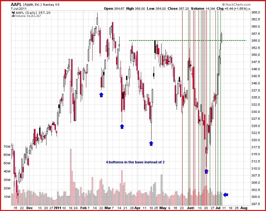
The chart below shows some such boxes and the arrows point out where prior waves are completely retraced in less time than they took to form. Another instance I didn't box is from the June 2010 high to the July 1st 2010 low which retraced the immediately prior wave in less time than it took to form. Now while I don't have boxes on here to visualize this, a new downward patter could possibly have started on June 1st of this year. However, based on what has happened since then, it probably was of a smaller degree and the upward pattern from mid-April is still forming.

Click on Chart to Enlarge

Now when you start putting the patterns together and building them into Elliott Wave structures, you can track the unfolding progress as such (see below). There are some other rules like "b" or "2"must be more time consuming than "a" or "1" in flats, zig-zags, or impulses, that determine whether I label something as "a" then "b" or "w" then "x", etc. But I will not go into all those here.
Click on chart to Enlarge

Sentiment data can at times be very useful in confirming a labeling sequence or give you insight into the psychology behind the waves. For instance, last summer, the AAII survey hit its most bearish level of the correction right at the end of August even though price was at a higher low than the July low. This is good confirmation that the psychological price trend was still down until then, and no pattern had completed at the July low. Then the move to follow retraced the prior wave down in the same amount of time than it took to form, indicating the trend had then changed.

Click on the Chart to Enlarge

On a shorter time frame and more technical note, there is not any bearish divergence on the 60 min chart of the stock averages right now, suggesting that there needs to be some time and consolidation before a significant pullback will occur. But based off of the larger pattern implications, it could be a very significant high when it occurs, and should lead to a very explosive downward move if the pattern labeling above is correct and an upward flat pattern is completing.

A couple of the other rules are that after a flat pattern completes, the following price action must completely retrace wave "c" of the flat in less time than it took to form. Also, the trendline from the beginning of the pattern to the low of wave "b" in this case, should be broken in less time than wave "c" took to form as well. Since that trendline is downward sloping in this case, the following move should be very explosive if this is correct.