While I don't know if it means anything, the TICK values have been getting more volatile the last 2 weeks, somewhat reminiscent of late April and early May. Also the OEX put/call ratio has rocketed up to historic levels in recent days. I wonder if these are signs of program trading "instability"?
On a different note.....Happy belated Thanksgiving to all out there!
Friday, November 26, 2010
Tuesday, November 23, 2010
OEX Put/Call Spike
 Click on Chart to Enlarge
The "smart money" OEX put/call ratio has spiked over the last couple weeks. The OEX data had been about the only data that held out and supported further gains earlier this month. Now it has reversed and is looking to have a bearish hue. What is the meaning? Don't know for sure, but it seems they have a mind to hedge right now, and usually they do a pretty good job.
An interesting thing to notice about the data if you look closely is that often the highest spike in the data occurs shortly after a high, rather than before or right at it. So it seems that they wait for an initial break to indicate a possible trend change, then they really get the most bearish at the first rebound to a lower high after that break. That is basically what has just happened in our case too.
So my take is still that this is a failed breakout pattern on the S&P 500 and that prices are more likely to head lower over the coming few months. The USD/EURO is also confirming this idea at the time being. Also there have been several distribution days in a cluster the last 2 weeks after a high. For those that follow Investor's Business Daily at all, this basically indicates that institutions are starting to pick up their selling near a high, and that behavior often occurs near market highs.
Tuesday, November 16, 2010
Update
The S&P 500 broke 1192 this morning which makes this decline the largest of any since the late August lows. So while the short-term is somewhat oversold, this may just be the beginning of an intermediate time frame decline.
Also remember to watch the VIX and the 22.54 level. If we close above there, that would be a higher high on the VIX which would be added evidence that a larger decline may be underway.
Also watch the number of NYSE new lows. If the number of new lows exceeds 50, that would also be a sign that a larger correction may take place.
Saturday, November 13, 2010
Options Data is Excessively Bullish
 Click on Chart to Enlarge
The Options Speculation Index from Sentimentrader.com is now well above the April highs. Without a doubt there is a great deal of bullish fever happening now. There are some other indications from Rydex data and CoT data that there is serious excessive bullish speculation going on particularly in the Nasdaq 100. Small retail trader call buying also jumped this past week. That is not a good sign for bulls. Also it is interesting to me in that the market fell this week (the most in a couple months.
 Click on Chart to Enlarge
The chart above is the EUR/USD currency pair. It shows an idea of price pattern development. The idea shown is not a standard Elliott Wave pattern, but based on logical concepts and sentiment data, I think it is reasonable. If the next move down retraces the recent move up in less time than it took to form, then that would generally support this basic idea.
The other main option would be that there is a large multi-year downward sloping contracting triangle forming, which should be completing a "d" wave and move down for an "e" wave at a minimum.
Also data from FXCM retail Forex brokerage indicates that their clientele has just now gone net long the Euro/USD after being net short the whole recent rally. That is often a sign of a trend change in their data. Basically I think it results from a combination of dumb money finally believing the current trend and buying into it, as well as a capitulation point of stop outs and margin calls that quickly liquidate the shorts at the peak of the trend leaving now mostly longs left, but at a trend that is now turning down.
As for stocks, if the S&P doesn't quickly retake the 1220 April high, then I would expect it to accelerate down. I don't really expect a consolidation/sideways move at this point.
Friday, November 12, 2010
Quick Note
If the s&P 500 drops to 1192 that will be 2.8% correction off the highs which will be 1.2 times greater than any other pullback on this last leg up. That would be a sell or short signal on an intermediate time frame.
In any case, that would basically confirm the outlook that a correction is underway. I already believe that is the case based on the failed breakout of the April highs. Other signs to look for are a close below the large gap up from last week and a VIX close above 22.60.
In any case, that would basically confirm the outlook that a correction is underway. I already believe that is the case based on the failed breakout of the April highs. Other signs to look for are a close below the large gap up from last week and a VIX close above 22.60.
Tuesday, November 9, 2010
Major Reversals Today in the Markets
 Click on Chart to Enlarge
Today the major indexes formed bearish reversal candlesticks across the board. QQQQ, SPY, and IWM all formed nice bearish engulfing patterns. Also, several other markets formed reversals too (more info below).
As per the last few posts.....almost all successful breakouts in the S&P above a prior intermediate high did not close back below the old high. So i noted that we should look for that as a first clue about the future direction of the market. Today the S&P 500 closed back below the April high, so that is a warning sign that the move up may not be sustainable. If you go through a lot of charts, you will see that a failed breakout will often lead to a sharp decline back below the low of the recent leg up. In this case that would be the Aug/Sept lows in stocks. Also, it often will happen faster than the advance. So, I can't predict the future, but I am just saying that from a charting standpoint, that would be relatively normal. Even if it seems absurd now, the possibility is reasonable.
Another interesting thing to note is that the recent high bumped into a geometric resistance line that also capped the advance in June before a sharp decline into July 1st (see the red circles above). Maybe this is meaningless, but I thought I'd put the line on the chart. The pink lines are some points of significance based on price patterns which I won't get into here.
 Click on Chart to Enlarge
As noted a few days ago, the US Dollar recently broke a pseudo trendline amidst the FOMC news and QE2 announcement. I noted that it may be an ideal reversal point for a bottom. Well it is back above the trendline and up 3 days in a row. There is a sharp bullish divergence on the RSI and MACD suggesting that price is bottoming here. Check the chart for further notes.
Why is this important? Because all markets are keying off the US Dollar, and it trades inversely to most other markets you may be watching like stocks, gold/silver, oil, etc. So if it has bottomed and starts up, it won't be long till stocks turn down, if not immediately. Also, remember that sentiment is super bearish on the US dollar, and so a major advance could be in the cards. Another interesting thing to note is that the US Dollar Index has made, as of now, a higher bottom than the one last year, while stocks have made higher highs. So there is a non-confirmation here that suggests stocks will turn down and the Dollar turn up.
 Click on Chart to Enlarge
This is a blow off if I've ever seen one. And the sentiment is uber-bullish to boot. This chart is the SLV silver ETF. The volume exploded to astronomical proportions and the range was >10% which swamps any daily range in a long time. In the end, it formed a bearish engulfing candlestick pattern. And the RSI is in a bearish divergence position. Get the heck out if you are in.
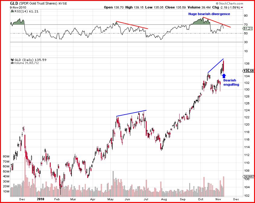 Click on Chart to Enlarge
The action in gold wasn't as dramatic but it also formed a bearish engulfing pattern, with an even stronger bearish divergence on the RSI than silver. If you look through the charts of gold and silver the last few years, you consistently see volume swell right at the tops. That is happening again. I think the odds of a correction in gold are very high.
As for bonds, the weekly chart of the 30 year bond interest rate suggests a major bottom may have formed, so the price of TLT or long term US bonds is likely to continue to fall longer term. Also there was a nice harmonic bullish ABC pattern that was set-up prior to today's decline. I take today's decline as a warning that the pattern may fail and that the longer term trend is indeed turning down in bonds. Also of note is that both stocks and bonds were down today. Most often they have traded inversely to each other. I have suggested for months that I expect there to come a time where that inverse relationship ends and both sell off in tandem. Maybe we are on the brink of that now.
But as always keep an eye out for bottoming signs in bonds. The daily RSI is almost oversold and so a bullish reversal candlestick may be respected. There is, however, no divergence on the daily chart technicals, so even if a bullish candle shows up, it may be best to wait for any rally and then gauge the first pullback from the rally to see if it looks like it will make a higher low, or if it will come down further to form some divergence.
Hopefully this helps. If you are on the fence on making decisions right now with trades or investments, my suggestion is still that one should get out of most everything except the US Dollar. Now that is exactly the opposite of popular wisdom right now, but that is all the more reason to do it.
Saturday, November 6, 2010
Pattern Update
 Click on Chart to Enlarge
Without going into too much detail, I think the most likely possibility at this point from a logic/pattern standpoint is that the move up since September has started a new pattern in the S&P 500. I believe it is most likely to be either a triangle or flat type pattern. In either case the high of this leg may be the high of this bull market before a bear market of sorts. The defining point will be whether any subsequent decline exceeds the Sept. lows on the downside. If so, then I think any new highs would be very unlikely. The pattern in the chart above is one logical possibility. But if any subsequent correction is rather small followed by a move to new highs, then that would not really fit with this idea.
Also since the market is at new highs now, there is no question that this move up is a leg up in a bull market. Now I don't have any hard stats on this, but from going through charts in the past the average leg up in a bull market lasts approximately 4 months. So at a little over two months this leg up may have some time to go. But from the sentiment data I would say that it probably is likely not to have much longer before at least a normal correction.
Thursday, November 4, 2010
Brief Update
 Click on Chart to Enlarge
The chart above is the US Dollar index. Today it broke below and closed below the often noted "trendline" across the 2008 and 2009 lows. Some seem to expect it to lead to a free fall in the dollar. My expectation would be that the break of a suspect trendline would be an ideal reversal point. The daily MACD is now in a nice bullish divergent position, so the technical analysis fits with this idea. Reversal points often occur slightly above or below established trendlines.
 Click on Chart to Enlarge
The Dow and S&P now both have exceeded the April 2010 highs. So this will create some headlines, run some stops, and set-up a double top possibility. The next possible time relationships that come into play are that as of today the move up from the August lows equals the time of the prior three "waves" combined (blue boxes). Then in about 2 weeks, the time up from the July low will equal the time from the February low to the July low (pink boxes).
Another outstanding feature of today is that the S&P 500 closed above the 3 standard deviation Bollinger Band. This is a rare occurrence. The last time it occurred was 6 days prior to the March 2000 "tech bubble" bull market high. I looked for other times it occurred back into the 80's, and it was rare. The other times the market generally continue higher. It was more common for the market to break below the lower band, but this only occurred every couple years on average.
Looking back through the charts, when the S&P broke out to a new high above a prior intermediate high, the market typically did not close back below the old high if the trend was to continue. Then there were times like July and Oct 2007 where the market broke out to a new high, but then closed back below and led to sharp corrections. So that seems like the first clue to look for here over the next 1-2 weeks.
Subscribe to:
Posts (Atom)