Merry Christmas all!
Make each year better than the last.
Saturday, December 25, 2010
Wednesday, December 22, 2010
Bullish Sentiment at Nosebleed Levels
The Investor's Intelligence Survey today showed 58.8% bulls which is the highest since the Oct 2007 bull market peak. Throughout the past decade most bullish % peaks have been around 60 to 63% with moves to 60 or above occurring at some major peaks.
Equity put/call ratios remain low and indicate complacency in the options market. However the last few days the OEX "smart money" put/call ratio has been quite high indicating that these traders are hedging here.
It seems most likely that the market tops soon or drifts modestly higher over the next 1-2 weeks to be followed by a sharp decline to the November lows at a minimum. But over the intermediate term based off of the sentiment and historical closest fit precedents, the correction will likely be longer and more complex than that.
The S&P 500 is now just under a resistance line noted in a prior post. Certainly it seems a good time to lighten on stock exposure. Based on the daily chart of bonds and the stock/bond ratio I thinks bonds are oversold and should put in some form of rally, though I only expect it to be a bear market rally in a long term downtrend.
Tuesday, December 21, 2010
Multiple Time Frame Bearish Divergence
 Click on Chart to Enlarge
 This chart of SPY is a 90 minute chart. It shows a significant bearish divergence on this time frame as the market has pushed above last week's highs.
 Click on Chart to Enlarge
 This chart is the daily chart of SPY. It shows a very nice (basically picture perfect at this point) bearish divergence on this time frame. In addition the weekly chart shows a MACD bearish divergence with the April highs at this point. So there are multiple time frames suggesting a pullback from here.
The daily chart RSI also touched overbought today suggesting we may see things pullback from here. Now generally around the Holidays volume tails off and prices tend to trend up. So maybe now isn't the perfect time for a pullback, but the stage is set.
If we see a classic reversal candlestick, then that could be a confirmation of topping action.
 Click on Chart to Enlarge
This is probably the most important thing to watch right now. The QQQQ (Nasdaq 100) is 17 cents from matching the 2007 high. Ideally before any significant decline we should see it break above that high at least briefly. This could create a double top situation. On the other hand, if the market continues up after exceeding that high, then that would be a typical bullish signal. I will update if/when we break the highs to gauge the legitimacy of the breakout.
Sunday, December 12, 2010
Excessively Optimistic Options Data


 Click on Charts to Enlarge
Across the board options data is showing extremely high bullish sentiment. The charts above show it from a few angles. The options speculation index shows total bullish bets versus bearish bets. The bullish bets are swamping the bearish bets more than any other point since near the "tech bubble" highs.
The detrended equity put call ratio shows that the shorter term average of put call ratios is much more bullish than the longer term. This data tends to revert to a mean of zero, and if extremes reach 20% from that, it is often a turning point in the markets. The 5 day average of the equity put/call ratio is lower than any time since April of this year, and it is not too far off from that.
The ISE equity call/put ratio rocketed up Friday. This puts it at an extreme level right at the range where it peaked in April of this year. Also the 10 day average is higher than it has been in quite a while. All these suggest that the bullish sentiment is at an extreme and is likely to back off over the intermediate term.
 Click on Chart to Enlarge
I noted in early November that I thought the US Dollar index would probably have a false trendline breakdown, and then start to rally. That is precisely what happened. Now is has backed off a bit as the market has rallied the last couple weeks. But the strength of the move down in the USD is weak compared to what it typically has been when stocks are uptrending. I think this is another clue that stocks are topping here and the USD is in a continuing uptrend.
Related to this, there are several commodities that I think are in very good position to short. Cotton being one (BAL is an etf to take advantage of moves in cotton). The grains also look nice to short, with etf's like DBA offering an equity opportunity to take advantage of that. Gold has put in a bearish candlestick pattern at a short-term double top with divergent technicals. Also oil looks like it may have topped as well or is in the process.
In any case, my suggestion is that commodities will back off significantly in the months ahead, and the USD will likely continue up for a while. I would also expect stocks to fall in the months ahead.
 Click on Chart to Enlarge
This chart shows the beautiful bearish divergence in the SPY etf daily chart. A top should form soon if the divergence is to remain. Also, not shown is that there is a bearish divergence on the weekly RSI and MACD of the major indexes as well.
One thing that may argue for some further upside in stocks is that the QQQQ is only a couple percent shy of its Oct 2007 bull market high. It may be ideal to see it double top above that level before putting in any meaningful decline. Related to this, the Rydex data is currently showing a preference for Nasdaq 100 funds that is 34 to 1 bull to bear ratio. That is near levels at the tech bubble high. So we have in the last couple months seen an historic build up of short Nasdaq 100 futures positions by the "smart money" and a huge build up of longs in the "dumb money" Rydex funds. Longer term this is ostensibly negative for stocks.
 Click on Chart to Enlarge
Bonds are oversold on an intermediate term technical basis. There is a nice bullish divergence on the daily chart of TLT. The inverse correlation is still holding between stocks and bonds. If bonds turn up, then stocks probably will move down. I want to reiterate that I think it most likely that we have seen longer term highs in long term bonds though. So I am not suggesting that this is a great investment buying opportunity, though it may be a nice trading opportunity.
Saturday, December 11, 2010
Quick Note
I will probably get a post up this weekend, but in short everything is set for an intermediate term decline. Sentiment is running excessively bullish and a nice technical bearish divergence exists on the daily chart. Other than the winter of 2006, set-ups like this have been on the money for nice intermediate term declines.
Friday, November 26, 2010
Quick Thought
While I don't know if it means anything, the TICK values have been getting more volatile the last 2 weeks, somewhat reminiscent of late April and early May. Also the OEX put/call ratio has rocketed up to historic levels in recent days. I wonder if these are signs of program trading "instability"?
On a different note.....Happy belated Thanksgiving to all out there!
On a different note.....Happy belated Thanksgiving to all out there!
Tuesday, November 23, 2010
OEX Put/Call Spike
 Click on Chart to Enlarge
The "smart money" OEX put/call ratio has spiked over the last couple weeks. The OEX data had been about the only data that held out and supported further gains earlier this month. Now it has reversed and is looking to have a bearish hue. What is the meaning? Don't know for sure, but it seems they have a mind to hedge right now, and usually they do a pretty good job.
An interesting thing to notice about the data if you look closely is that often the highest spike in the data occurs shortly after a high, rather than before or right at it. So it seems that they wait for an initial break to indicate a possible trend change, then they really get the most bearish at the first rebound to a lower high after that break. That is basically what has just happened in our case too.
So my take is still that this is a failed breakout pattern on the S&P 500 and that prices are more likely to head lower over the coming few months. The USD/EURO is also confirming this idea at the time being. Also there have been several distribution days in a cluster the last 2 weeks after a high. For those that follow Investor's Business Daily at all, this basically indicates that institutions are starting to pick up their selling near a high, and that behavior often occurs near market highs.
Tuesday, November 16, 2010
Update
The S&P 500 broke 1192 this morning which makes this decline the largest of any since the late August lows. So while the short-term is somewhat oversold, this may just be the beginning of an intermediate time frame decline.
Also remember to watch the VIX and the 22.54 level. If we close above there, that would be a higher high on the VIX which would be added evidence that a larger decline may be underway.
Also watch the number of NYSE new lows. If the number of new lows exceeds 50, that would also be a sign that a larger correction may take place.
Saturday, November 13, 2010
Options Data is Excessively Bullish
 Click on Chart to Enlarge
The Options Speculation Index from Sentimentrader.com is now well above the April highs. Without a doubt there is a great deal of bullish fever happening now. There are some other indications from Rydex data and CoT data that there is serious excessive bullish speculation going on particularly in the Nasdaq 100. Small retail trader call buying also jumped this past week. That is not a good sign for bulls. Also it is interesting to me in that the market fell this week (the most in a couple months.
 Click on Chart to Enlarge
The chart above is the EUR/USD currency pair. It shows an idea of price pattern development. The idea shown is not a standard Elliott Wave pattern, but based on logical concepts and sentiment data, I think it is reasonable. If the next move down retraces the recent move up in less time than it took to form, then that would generally support this basic idea.
The other main option would be that there is a large multi-year downward sloping contracting triangle forming, which should be completing a "d" wave and move down for an "e" wave at a minimum.
Also data from FXCM retail Forex brokerage indicates that their clientele has just now gone net long the Euro/USD after being net short the whole recent rally. That is often a sign of a trend change in their data. Basically I think it results from a combination of dumb money finally believing the current trend and buying into it, as well as a capitulation point of stop outs and margin calls that quickly liquidate the shorts at the peak of the trend leaving now mostly longs left, but at a trend that is now turning down.
As for stocks, if the S&P doesn't quickly retake the 1220 April high, then I would expect it to accelerate down. I don't really expect a consolidation/sideways move at this point.
Friday, November 12, 2010
Quick Note
If the s&P 500 drops to 1192 that will be 2.8% correction off the highs which will be 1.2 times greater than any other pullback on this last leg up. That would be a sell or short signal on an intermediate time frame.
In any case, that would basically confirm the outlook that a correction is underway. I already believe that is the case based on the failed breakout of the April highs. Other signs to look for are a close below the large gap up from last week and a VIX close above 22.60.
In any case, that would basically confirm the outlook that a correction is underway. I already believe that is the case based on the failed breakout of the April highs. Other signs to look for are a close below the large gap up from last week and a VIX close above 22.60.
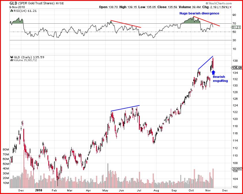
Tuesday, November 9, 2010
Major Reversals Today in the Markets
 Click on Chart to Enlarge
Today the major indexes formed bearish reversal candlesticks across the board. QQQQ, SPY, and IWM all formed nice bearish engulfing patterns. Also, several other markets formed reversals too (more info below).
As per the last few posts.....almost all successful breakouts in the S&P above a prior intermediate high did not close back below the old high. So i noted that we should look for that as a first clue about the future direction of the market. Today the S&P 500 closed back below the April high, so that is a warning sign that the move up may not be sustainable. If you go through a lot of charts, you will see that a failed breakout will often lead to a sharp decline back below the low of the recent leg up. In this case that would be the Aug/Sept lows in stocks. Also, it often will happen faster than the advance. So, I can't predict the future, but I am just saying that from a charting standpoint, that would be relatively normal. Even if it seems absurd now, the possibility is reasonable.
Another interesting thing to note is that the recent high bumped into a geometric resistance line that also capped the advance in June before a sharp decline into July 1st (see the red circles above). Maybe this is meaningless, but I thought I'd put the line on the chart. The pink lines are some points of significance based on price patterns which I won't get into here.
 Click on Chart to Enlarge
As noted a few days ago, the US Dollar recently broke a pseudo trendline amidst the FOMC news and QE2 announcement. I noted that it may be an ideal reversal point for a bottom. Well it is back above the trendline and up 3 days in a row. There is a sharp bullish divergence on the RSI and MACD suggesting that price is bottoming here. Check the chart for further notes.
Why is this important? Because all markets are keying off the US Dollar, and it trades inversely to most other markets you may be watching like stocks, gold/silver, oil, etc. So if it has bottomed and starts up, it won't be long till stocks turn down, if not immediately. Also, remember that sentiment is super bearish on the US dollar, and so a major advance could be in the cards. Another interesting thing to note is that the US Dollar Index has made, as of now, a higher bottom than the one last year, while stocks have made higher highs. So there is a non-confirmation here that suggests stocks will turn down and the Dollar turn up.
 Click on Chart to Enlarge
This is a blow off if I've ever seen one. And the sentiment is uber-bullish to boot. This chart is the SLV silver ETF. The volume exploded to astronomical proportions and the range was >10% which swamps any daily range in a long time. In the end, it formed a bearish engulfing candlestick pattern. And the RSI is in a bearish divergence position. Get the heck out if you are in.
 Click on Chart to Enlarge
The action in gold wasn't as dramatic but it also formed a bearish engulfing pattern, with an even stronger bearish divergence on the RSI than silver. If you look through the charts of gold and silver the last few years, you consistently see volume swell right at the tops. That is happening again. I think the odds of a correction in gold are very high.
As for bonds, the weekly chart of the 30 year bond interest rate suggests a major bottom may have formed, so the price of TLT or long term US bonds is likely to continue to fall longer term. Also there was a nice harmonic bullish ABC pattern that was set-up prior to today's decline. I take today's decline as a warning that the pattern may fail and that the longer term trend is indeed turning down in bonds. Also of note is that both stocks and bonds were down today. Most often they have traded inversely to each other. I have suggested for months that I expect there to come a time where that inverse relationship ends and both sell off in tandem. Maybe we are on the brink of that now.
But as always keep an eye out for bottoming signs in bonds. The daily RSI is almost oversold and so a bullish reversal candlestick may be respected. There is, however, no divergence on the daily chart technicals, so even if a bullish candle shows up, it may be best to wait for any rally and then gauge the first pullback from the rally to see if it looks like it will make a higher low, or if it will come down further to form some divergence.
Hopefully this helps. If you are on the fence on making decisions right now with trades or investments, my suggestion is still that one should get out of most everything except the US Dollar. Now that is exactly the opposite of popular wisdom right now, but that is all the more reason to do it.
Saturday, November 6, 2010
Pattern Update
 Click on Chart to Enlarge
Without going into too much detail, I think the most likely possibility at this point from a logic/pattern standpoint is that the move up since September has started a new pattern in the S&P 500. I believe it is most likely to be either a triangle or flat type pattern. In either case the high of this leg may be the high of this bull market before a bear market of sorts. The defining point will be whether any subsequent decline exceeds the Sept. lows on the downside. If so, then I think any new highs would be very unlikely. The pattern in the chart above is one logical possibility. But if any subsequent correction is rather small followed by a move to new highs, then that would not really fit with this idea.
Also since the market is at new highs now, there is no question that this move up is a leg up in a bull market. Now I don't have any hard stats on this, but from going through charts in the past the average leg up in a bull market lasts approximately 4 months. So at a little over two months this leg up may have some time to go. But from the sentiment data I would say that it probably is likely not to have much longer before at least a normal correction.
Thursday, November 4, 2010
Brief Update
 Click on Chart to Enlarge
The chart above is the US Dollar index. Today it broke below and closed below the often noted "trendline" across the 2008 and 2009 lows. Some seem to expect it to lead to a free fall in the dollar. My expectation would be that the break of a suspect trendline would be an ideal reversal point. The daily MACD is now in a nice bullish divergent position, so the technical analysis fits with this idea. Reversal points often occur slightly above or below established trendlines.
 Click on Chart to Enlarge
The Dow and S&P now both have exceeded the April 2010 highs. So this will create some headlines, run some stops, and set-up a double top possibility. The next possible time relationships that come into play are that as of today the move up from the August lows equals the time of the prior three "waves" combined (blue boxes). Then in about 2 weeks, the time up from the July low will equal the time from the February low to the July low (pink boxes).
Another outstanding feature of today is that the S&P 500 closed above the 3 standard deviation Bollinger Band. This is a rare occurrence. The last time it occurred was 6 days prior to the March 2000 "tech bubble" bull market high. I looked for other times it occurred back into the 80's, and it was rare. The other times the market generally continue higher. It was more common for the market to break below the lower band, but this only occurred every couple years on average.
Looking back through the charts, when the S&P broke out to a new high above a prior intermediate high, the market typically did not close back below the old high if the trend was to continue. Then there were times like July and Oct 2007 where the market broke out to a new high, but then closed back below and led to sharp corrections. So that seems like the first clue to look for here over the next 1-2 weeks.
Sunday, October 31, 2010
Expecting Fireworks
It seems apparent that there will be no real price movement in stocks until after some news events this week as far as elections and the FOMC meeting. I really don't see the elections as much of a market moving event unless the Constitution party wins a majority in both houses and in addition Obama decides to step down after it occurs because he can't work with people who are sticklers on the Constitution.
But I could see the FOMC verbiage about QE 2 lead to a significant price reaction. My belief based on technical analysis and sentiment analysis is that the market is set to make a swift retracement of recent gains, and possibly resumption of a longer term "secular bear market." So even if the announcement sounds good, it may get sold at least short-term.
But I could see the FOMC verbiage about QE 2 lead to a significant price reaction. My belief based on technical analysis and sentiment analysis is that the market is set to make a swift retracement of recent gains, and possibly resumption of a longer term "secular bear market." So even if the announcement sounds good, it may get sold at least short-term.
Thursday, October 28, 2010
RSI and Total Put/Call Ratio Divergence
The list of divergences in the current market are about maxed out. Just about every measure of market strength is showing bearish divergence. Let's look at a few more....
 Click on Chart to Enlarge
The total put/call ratio often diverges with price at market highs. It does often at lows also, but more so at larger degree lows. The chart above shows (in RED) times when the put/call ratio was starting to pick up even as prices moved higher. When this occurs noticeably within a wave up, it often results in a sharp correction. It also shows (in GREEN) times when the market was falling to new lows but the put/call ratio was not, indicating a lessening of fear and a change in underlying sentiment. Emotion/sentiment leads price. And price leads fundamentals. But everything known about the market boils down to one end result -- the market price. So price is the most important thing to study, but if you can find ways to measure the emotional component, you can then often be tipped off to when the emotional current is weakening, etc, and price should follow suit in the future.
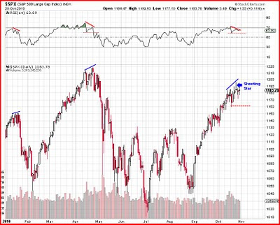 Click on Chart to Enlarge
The RSI has formed a nice bearish divergence set-up on the major market averages. As the market have pushed higher the last week or so, the RSI has not, making a distinct lower peak. One way to use RSI to take a trade set-up like this, is to sell short when the RSI breaks below the most recent trough - in this case where I have the horizontal dashed line on the RSI chart.
The largest decline seen in this leg up in the S&P 500 has been 2.3%. So a 2.8% decline would be about 1.2 times as big as that. Assuming the highs on Monday are not exceeded, a 2.8% decline would put the S&P around 1162. So that is another sensible entry method for taking a short position in the market. In both cases the stop would go a tick/penny above the high for the rally.
Also note the shooting star candlestick on Monday which is a top reversal candlestick pattern. While there has been no follow through, we might be a little more forgiving given the upcoming events next week (FOMC and elections). It just seems that the market is not going to do much until then.
So to recap some of the last couple weeks posts and add some new info.....
1) There is bearish technical indicator divergence with price
2) There is bearish divergence in breadth (McClellan Osc, Adv/Dec, TICK, etc)
3) There is bearish divergence in volume (down vol, etc)
4) There is bearish divergence in the put/call data
5) There is bearish divergence in volatility (VIX)
6) There is bearish divergence in new highs-new lows
7) The S&P/Dow are not confirming new highs with the Nasdaq 100 which is a non-confirmation of sorts
Also of note is that the AAII survey is about as bullish as it has been in several years, which doesn't necessarily mean a major decline, but should indicate a pullback ahead at least.
So there is no question in my mind that the market is set-up to correct from here. Maybe it won't, but I think the odds of a "sell the news" type of response to upcoming news are a lot higher than a rally on the news.
 Click on Chart to Enlarge
The TLT ETF is showing a nice bullish divergence today on the 120 min chart above. If it moves higher then that would typically correspond with a move down in stocks.
Now longer term I think that bonds will fall, but the negative correlation has not really broken down yet between stocks and bonds. So in addition to the overvalued stock/bond ratio, this price pattern may suggest bonds move up from here (and stocks down probably). There is no confirmation of a move up yet though...I'm just noting the set-up right now.
Tuesday, October 26, 2010
TBT Follow Up (and More)
 Click on Chart to Enlarge
The stock to bond ratio on Sentimentrader.com is showing stocks overvalued relative to bonds currently. Typically stock will back off at extremes like this. With the overall correlations, it would be likely for bonds to rally during that time. Now I do believe that we will see most bonds fall if stocks correct, but usually the US Treasuries rally as stocks correct. That correlation has been weakening of late, but not enough that I think it makes a lot of sense to bet against bonds right now.
On that note, I am going to post an exit order on the TBT trade which is inverse to bonds.
Trade Action:
Place a GTC sell limit order at 34.42 for TBT.
 Click on Chart to Enlarge
The S&P 500 touched the 88.6% retracement yesterday and then reversed to form a shooting star candlestick. There was no downside follow through today, but with the time being stretched for this move, it may stick as a reversal. The gap at 1202 was not filled which leaves some upside chart headroom. Now the Dow 30 came within 10 point (a fraction of a percent) from the April high yesterday also before reversing to form a shooting star.
The gap yesterday had some characteristics of an exhaustion gap up. It was fairly large relative to the gaps in the trend, and it occurred on a notable news item (the G20 meeting announcement). So as long as Monday's highs hold, I respect it as a valid reversal.
One thing that has been missing that may be significant as a topping sign is that the OEX put/call ratio jumped to 1.51 today which is as high as it has been in a couple months. Remember that the OEX put/call ratio is typically a smart money indicator. So it usually jumps up near highs.
Friday, October 22, 2010
Waiting on the G20?
 Click on Chart to Enlarge
This chart here shows the VIX on the top and the NYSE down volume in the main pane. Both typically move inversely to stock prices. It is interesting to note that divergence appears at turning points in this chart. Even though volatility is languishing and the market is holding up or advancing, the down volume is starting to pick up. This likely indicates the early phase of selling into the highs by institutional players.
As a side note, the price range in the equity markets (and some others) was tiny today. It seems that the markets are awaiting something from the G20 meeting as far as currency policies go. Let me make it clear that the sentiment stage is set for a huge move up in the US Dollar relative to other currencies. So my assumption is that this will occur and use whatever spark necessary. I expect the US dollar to take off to the upside next week and stocks to start down. Keep in mind that the "currency wars" theme has been headline news everyday recently, it is the focus in the G20, and it made the cover of The Economist recently. Those are all signs that the current trend is ending. Think opposite the crowd.
Also, I will go into more detail on this later.......But if the market is topping out here and embarking on a significant decline, there should be high probability of large gap downs in this next leg down as it unfolds, and probably a swoon event more severe than any seen in the last couple years.
My suggestion on an investment basis is to be 100% out of stocks. The best buy opportunity I think is the US Dollar. I also believe natural gas will probably be a good investment play at these levels. It seems to me that the carry trade is largely responsible or at least correlated with the natural gas decline. So when the carry trade gets unwound and the US Dollar rises, I think natural gas will too. Stay away from gold now as well too. It is way overbought and may be set for a much larger decline than the recent pullbacks over the last year or two.
Thursday, October 21, 2010
SPX Update
 Click on Chart to Enlarge
There are several things today that suggest maintaining a stance that a market high is imminent is sensible. The chart above shows a compelling time relationship in that on Monday the advance since July will be 1.618 time as long as the fall from April to July, AND the time of the current leg up will be equal to the time of the last two "waves" (early July to early Sept). So maybe this week is it as far as the advance goes.
Now the Dow 30 is very close to the April highs. It is only about 0.5% shy. A nice topping scenario may be for it to double top today or tomorrow, while the S&P still lags below the April highs.
There are several little non-confirmations or divergences happening today to that suggest the rally is ending. Neither gold nor silver nor the Euro are making new highs this morning while stocks are. Given the correlations and % declines, it looks like those markets may have already topped, and that this is a last gasp in stocks. Also the VIX is not making new lows compared to last week. That has often happened at the end of a leg up in stocks as sell.
Tuesday, October 19, 2010
USD Index Reversal Pattern
 Click on Chart to Enlarge
Today the US Dollar Index provided several significant cues that it is making a trend reversal.
-made a bullish MACD cross on the daily chart
-formed a bigger white candlestick than any since the decline began in June
-the % advance is significantly larger than any any since the August top suggesting a new leg up has begun
Again the intermarket correlations suggest that the US stock market will likely decline if the US dollar does continue to rise. I think we will see a significant correction in stocks.
If the S&P 500 falls to 1154 or lower, that should be 1.2 times larger than the biggest decline since Sept. That would be good confirmation that a correction is underway in stocks.
Monday, October 18, 2010
Equity Put/Call Ratio and Flash Crash
 Click on Chart to Enlarge
The chart above is really for the Elliott Wave enthusiasts. It is the equity put call ratio with a 5 day average overlaid. Occasionally on the chart you can make out a little 5 wave push in one direction on the 5 day average. At which point the trend reverses and corrects. The current set up has a nice correction after the 5 wave push which retraces just a little over 61.8%. Maybe there will now be another move higher?
Also the 5 day average now sits at 0.52 which is where it bottomed in Oct 2009 and Jan 2010. It also hit that low level in March and April of this year and continued for a bit before correcting. So this dumb money measure is starting to hit extreme levels corresponding with market tops.
Also, I'm sure many of you know the market flash crashed again today after hours. It put the S&P 500 down to about 1065. But then all the trades were canceled. I read a few things on this and some people noted that a similar thing happened soon before the May 6th flash crash. I don't know if this means anything, but it makes you wonder if the machines are about to go for a spin again.
As another side note, AAPL was down 6% after hours on earnings. It has a 20% weighting in the Nasdaq 100, so we should see a decent gap down tomorrow. Personally, with the past stats on market performance after AAPL earnings when overbought, it wouldn't buy the gap down.
Sunday, October 17, 2010
New SDS Trade
New Blog Trade:
Buy SDS on the open Monday morning 10/18/10. I will post the blog entry as the opening price.
Buy SDS on the open Monday morning 10/18/10. I will post the blog entry as the opening price.
Market Showing Increasing Signs of Intermediate Term Top
A reasonably strong case could have been made the last couple weeks for a more significant pullback than we have seen. Now this past week's data makes it a very strong one. There was a big drop in "smart money" confidence this past week as measured by Sentimentrader.com. Also, the intermediate term models from Sentimentrader.com are now basically all overbought (they weren't last week).
When Oct. option expiration has occurred when the S&P futures were within 2% of a 3 month high it has always led to a pullback of a couple percent or so. Also the VIX made a bollinger band sell signal last week. It closed below it, and now is back inside. I have noted in the past the cyclical tendency for the market to rise into options expiration for the last year and a half, and then to fall or consolidate in the couple week following OpEx. So they expired Friday and look set to pull back soon this time.
The DIA (Dow 30) made an outside day reversal bar, and bearish engulfing candlestick. The Nasdaq composite made a hanging man top reversal candlestick. These need some confirmation to the downside for more confidence, but there is at least a hint of topping here. The US Dollar Index has formed a nice bottom reversal candlestick pattern amongst great bearish sentiment. This should be a catalyst for the stock market to decline.
The largest decline in the S&P since the early Sept. low has been 2.3%. So any decline larger than that would give added evidence that a larger correction will play out based on the tendency for trends to experience uniform corrections. The rule I have suggested in the past is to look for a move 1.2 or 1.25 times larger than any prior counter trend move. Currently this could require a 2.8+% decline to hit that threshold.
 Click on Chart to Enlarge
There are a few basic time relations that I look for that relate a move to its prior moves. One of them is that often one move may take the time of the two prior moves combined. This seems more often the case if the prior 2 moves were similar in time. There are time relations as well, but as pertains to the current situation, this is the longer time relation and is coming up the first couple days of this week.
 Click on Chart to Enlarge
Here is the Shooting Star in the Nasdaq Composite.
 Click on Chart to Enlarge
Here is the DIA bearish engulfing outside day. It is occurring right at a fibonacci confluence area and at the time relation mentioned above.
 Click on Chart to Enlarge
The NYSE McClellan Oscillator is showing some continuing strong bearish divergence on this move up. That basically means the amount of stocks driving the market higher is narrowing. Fewer and fewer stocks are holding up with the market. That is a signs of a tired leg up.
Cobra's Market View notes that the institutional selling is starting to perk up and is forming a bearish divergence right now. The charts he mentions are from StockTiming.com. So this fits in with the diverging McClellan Oscillator.
 Click on Chart to Enlarge
This is the US Dollar Index chart showing the nice candlestick reversal pattern after undercutting a prior wing low. The FXE (Euro Dollar) ETF made a bearish engulfing pattern Friday, and the UUP (US Dollar Bull ETF) made a bullish engulfing. These may reverse and drive the stock market lower.
On account of these I am posting a new inverse ETF trade on SDS.
Changes to Blog Layout
I am going to make some changes to the blog layout this week and also to the trading strategies. It was my original intention to continue with the current format throughout the end of the year, but for several reasons and feedback from readers, I am going to make the changes now.
Basically I am going to return to posting only trades on the stock indexes. And I will only have one trade going at a time. In think this will help to regain a high level of focus which has waned with following several different markets.
Basically the goal will be to outperform the S&P 500 compared to buy and hold. I will not post trade % allocations unless specified, just simply the trades and then track the performance on a cumulative basis. The individual reader needs to be responsible for money management strategies and diversification if desired. I will just focus on the trades and high quality set-ups.
I will still put educational material on the blog about other markets at times, but most content will be focused on short to intermediate term trades and set-ups on the stock indexes. All currently open trades will still be tracked until exit.
Your feedback or comments are welcome. I am willing to iron out some details of the format/layout over the course of the next few weeks dependent on feedback.
Wednesday, October 13, 2010
SPX Update
 Click on Chart to Enlarge
The S&P 500 pushed above 1175 today and closed above that level. The RSI became overbought today in the process. So while anything can happen, the chances are that the market uptrend is tired and will reverse significantly soon. Imprint the way the market "feels" to you right now, so that in the future you can remember the feeling associated with what happened in the market.
I like the fact that 1175 was taken out to the upside, but I would prefer things not go higher given my current positioning in the market. If the market were to top right here, that would be a fairly nice Gartley pattern. Given the position of the Euro, USD, and gold, I think the possibility is distinct of a rather large correction from these levels.
Now from a harmonic pattern perspective, a bearish Gartley top like this, will often lead to a major prolonged move down. So be aware of that possibility if things level off and reverse from here. I personally would trim down investment longs significantly if your time frame allows.
There still has been no candlestick reversal pattern yet on the daily or weekly chart. It would be nice to see that for some confidence that a high is being put in.
On a side note, maximum pain theory would suggest that options should expire a little below 1150 on the S&P 500 based off of today's data. So we may see a pullback into Friday on that account.
 Click on Chart to Enlarge
There are a couple high profile stocks that I believe will help us to know what the market will do from here. First is AAPL. It formed a very narrow range doji after a gap up today on a wider range day in the general market. There is a strong bearish divergence on the RSI and AAPL is at a Fibonacci resistance area. A downer tomorrow could confirm a bearish reversal pattern.
 Click on Chart to Enlarge
On another note, BIDU, another high flyer is not confirming the new highs over the last couple weeks. It is still stuck below. Sometimes the leading stocks give you reliable tells on the market. It looks to me like this may be one of those times.
Quick Note
The S&P 500 exceeded 1175 this morning and is thus far holding up. A reversal this afternoon could form a bearish candlestick pattern, but right now it seems unlikely that will be the case.
Of note, the Nasdaq 100 QQQQ set a new yearly high today above the April high. This has created a kind of non-confirmation between it and the other indexes. We probably shouldn't read too much into this, but it may be a bearish sign.
The next unfilled gap on the SPY etf is at 120.35. That is higher than I would like to see the market go if a top is forming here, but it is within reach now.
Bond Update - IEF and TLT
 Click on Chart to Enlarge
This chart is IEF, a 7-10 year bond ETF. Notice is has made new rally highs recently. But there is a great bearish divergence on the MACD indicator. This is a nice bearish set-up.
 Click on Chart to Enlarge
Now this is TLT which is longer term bonds (20+ years). Notice it has not made new rally highs with IEF. In the past this has often led to bond market weakness over the coming weeks.
I am inclined to stay with the current TBT trade because these charts and technical analysis lead me to believe that bonds will fall from here.
Monday, October 11, 2010
Updates - S&P, US Dollar, VIX, VIX/VXV
 Click on Chart to Enlarge
This is the S&P 500 cash chart. Today the market formed a doji candlestick right at the upper channel line of the channel drawn. I noted yesterday that the 78.6% retracement level of the decline is at 1175. That is a little overhead from here. A doji means that the market is in a state of balance. After a sustained trend that can indicate a turning point. However, if there is no reaction to the downside from here, then it may not mean a lot.
 Click on Chart to Enlarge
This chart is the US Dollar index. Of significance is that the dollar index was up today. It has been so negatively correlated with stocks recently, that I wonder if it is a tell that these markets may be at a turning point. A close above the 5 day EMA would be a first early signal that the current trend is weakening or reversing. Again, sentiment is very negative against the dollar, and it is due to rally. So even if it doesn't from here, keep it on the radar.
 Click on Chart to Enlarge
The VIX made a big move today. It gapped down and opened below the lower bollinger band. That doesn't happen too often. The last 2 times were mid Jan 2010 and mid April 2010 - not good times to be long. Times before those over the last couple years were generally near short-term highs at least, though not all were at intermediate term highs.
At times the VIX will diverge with stocks before stocks turn. So maybe the VIX will bottom but prices may move higher a bit before topping. I don't know - just stating some past tendencies.
 Click on Chart to Enlarge
Now this chart gets my attention!! The VIX/VXV ratio, which is short-term volatility divided by longer term volatility, is at a new low. The VXV is only about 3 years old, but today is the lowest ratio since the VXV inception.
This ratio has been good at highlighting rally highs over the last few years. There was one exception in July 2009 which threw me off, though in retrospect, it occurred after a correction rather than at a high, so that should maybe have been somewhat discarded. But looking at the chart above, the prior lows in the ratio were April and January of this year, early August of this year, and May 2008. Those were all times which saw significant corrections.
So, while there are not a huge amount of indicators screaming market top here, there are some high quality ones, and some confirming sentiment amongst related markets like the US Dollar, Euro, and gold. In addition, the market still may be forming a nice harmonic/fibonacci topping pattern.
Don't be surprised to see this market begin a significant pullback very soon.
Sunday, October 10, 2010
Bearish Gartley Pattern on SPX @ 1175
As of right now with the SPX pushing above the 1160 level, I would expect a move to 1175 before any reversal down. The 78.6% retracement of the entire April-July correction is at 1175 and the high of the bounce after the "flash crash" is at 1174ish. This is somewhat compelling in that most Elliott wave enthusiasts seem to believe that the move down from April to July 2010 was a "leading diagonal" in Elliott Wave Principle parlance. According to the experts, a leading diagonal is often retraced 78.6%. Even if the market does not top at that level, I would be somewhat surprised if it doesn't oblige or entice sellers at least temporarily at that level.
Also the market right now is in the wide price range of the mini crash in 2008 on the day of Lehman bankruptcy (Sept 29 2008). So I think this area (1100-1200) is a key level for the market. If the market pushes to new highs (above the April 2010 highs) then it would seem to me that the market accepts that those issues are behind us.
As of now there is no reversal candlestick pattern on the daily or weekly chart of the S&P 500. So for intermediate term bets to the downside, it would be nice to see something along those lines.
Thursday, October 7, 2010
Gold and Silver
If anyone was riding the gold and silver train up, I think this should be your exit. As long as they close around where they are now (1:30 ET) then they will form wide range bearish engulfing patterns.
I don't necessarily have a great reason to believe this will be a major top and lead to a bear market, but at least for the intermediate term, the sentiment is too bullish on silver, gold, and the Euro and way too bearish on the US dollar. So I think there will be a substantial reversal in all those markets.
I still believe the stock market will correct from near these current levels, but there are admittedly few sentiment extremes to note.
Sunday, October 3, 2010
Update
 Click on Chart to Enlarge
If the market is topping it here, it would be a nice harmonic pattern. The size and time consumption of what I have noted as wave "c" above is almost the exact same as wave "a". There are several fibonacci time relations pointing to late Sept/early Oct for a turn present on the chart above as well if you look at in depth.
Assuming the market does reverse down from here, one key will be to see if the market retraces more than 61.8% of the Sept rally. I have the retracements drawn on the chart. 61.8% would be a little below 1090 as of now.
 Click on Chart to Enlarge
One thing I often look at is what sectors are not confirming new rally highs, and in particular I look at the financial sector in the current market environment. You can see it is not confirming new highs on this rally the last week or so. When that has happened in the past, the market has usually been near a new correction.
If these charts mean anything, I would expect the market to fall this week.
Friday, October 1, 2010
Stocks, Silver, Gold - Topping I Think
 Click on Chart to Enlarge
Sentimentrader.com just noted this today. There was a huge jump in the net short level of commercial hedgers, which are typically "smart money," on Nasdaq 100 futures this week. Looking at the chart you can see it hasn't paid to be long the market after similar past spikes.
This data fits right in with my posted outlook that the S&P 500 (or markets in general) is likely topping at the 1160 area. Also the sentiment is very bearish on the US dollar and it should be primed for a good move higher, which typically will coincide with a falling stock market in the current market environment.
On other notes, sentiment on silver is very excessively bullish, and other than long term holders, I would definitely exit silver stocks or ETF's, etc. Sentiment on gold is starting to get too bullish and should be due for a pullback soon. I may post a chart of this, but in case I don't, if you look at the price of gold divided by the euro (i.e. FXE etf) you can see that the price of gold is not at new highs relative to the Euro, even though it is against the US dollar. In the past this has been a tell that gold should move down and the US dollar up over the coming weeks. So that adds to the technical and sentiment evidence .
Thursday, September 30, 2010
S&P 500 Update
 Click on Chart to Enlarge
This morning the S&P 500 cash hit 1157 which is right near the 1160 area I have suggested as a topping point for this rally. It has sold off since this morning, and looks like it may form a bearish engulfing pattern today if the price closes near where it is at noon ET.
A candlestick reversal pattern right in the resistance zone would be a good confirming point that my outlook may be generally correct right now. If the market does indeed experience a pullback or correction from these levels, there will be some keys to watch for that I will lay out in a future post. Basically, if the correction does not retrace more than 61.8% of the Sept rally, in less time than it took to form, then I would lean toward another push up to higher rally highs. But we'll look at those situations as they come.
No changes right now to any trades. EUO will probably rally if the market pulls back from here. I don't know about TBT. There is now a huge bullish divergence on UNG on both weekly and daily time frames. If someone is not in this, you may want to strongly consider it here at this level. I won't be too quick to exit TZA if the market manages to get short-term oversold. I will mainly watch the hourly chart technicals for oversold conditions before exiting.
Friday, September 24, 2010
Market Update
 Click on Chart to Enlarge
The chart above is a 120 minute chart of SPY which will kind of smooth some of the noise compared to the hourly chart. You can see that there is a running bearish divergence as each new push to highs recently has not been met with new MACD indicator highs.
Just overhead at 116ish is where I feel the most probably resistance zone is, though I could see it going a bit higher than that. My guess is that prices churn upwards a bit from here and then reverse rather sharply either next week or the following week.
So don't mistake.....the intermediate trend is still up. But I am thinking it won't last much longer.
2010 Trade Results So Far
 Click on Chart to Enlarge
This is a screenshot of 2010 trades up to this point. At $10,000 per trade, the closed trades have so far netted a little over $2000.
2009 Trade Results
 Click on Chart to Enlarge
Here is a spreadsheet of the long overdue 2009 blog trade results.
The second column from the right shows the running total of profit or loss from only the 2009 trades (assuming $10,000 devoted to each trade and no commissions). The furthest column to the right shows a running total of profits since I started the blog in 2008 (assuming $10,000 devoted to each trade and no commissions).
Thursday, September 23, 2010
Quick Update
I think the market is close to making at least a tradable swing high. Ideally I would like to see another push up to new highs before topping. The hourly chart is trending up on SPY but has a strong bearish divergence building.
I am seeing some very nice looking set-ups to the short side. Ones that stick out to me now are SWK, JNPR, ADSK, EBAY, BUCY, and UPS.
As far as other markets go.....Sentiment is running too bullish on grains after a big run up. I would get out of funds like DBA, GRU, JJG, etc.
There is a nice bullish divergence setting up on the daily chart on the US Dollar Index (UUP, EUO). I plan to hold the EUO trade right now in anticipation that it will rebound in coming months.
Gold is overbought, but at all time highs it is in a vacuum area where there is no overhead resistance. I would not jump in at these levels, but would not advise to short it until it gets more divergence, etc. Gold has bucked technical set-ups for top reversals, and my feeling is that this will be a market that remains stronger than it "should" based on technical analysis.
If there are any specific markets or stocks someone wants my input on, drop me a line in the comments.
Tuesday, September 21, 2010
AAII Update
 Click on Chart to Enlarge
The AAII survey has made a big jump in bullishness and now the ratio of bulls to bears is at an extreme level which has typically suggested market weakness ahead. Particularly in the context of an extreme at a lower price high I think this is significant.
A couple weeks ago I had suggested that the most likely scenario for the markets was to break above the 1130 level on the S&P 500, and to move up to 1160 before topping out. I still think that is probably the most likely scenario here based on retracement levels and price gaps, etc.
Some sentiment surveys and models are now confirming intermediate term overbought conditions to match.
On a side note, the TZA trade is obviously not following an ideal format. But there has been no oversold signal to exit the trade. Right now I doubt we will get one until the market is topped out, which I think should happen by next week most likely.
Subscribe to:
Posts (Atom)