Tuesday, July 31, 2012

Market Update - Pattern Analysis

Click on Chart to Enlarge

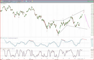
This chart contains a few things of interest.  This is the NYSE, though similar comments could apply for other indexes.

The green box is what I would consider an ideal projection for the end of the current wave up if the pattern up since the Oct 2011 low is an ABCDE pattern - a type of contracting triangle, but with a D wave that is larger than B.  This would imply a small upside potential from current levels of about 2%, with the time to complete being mid next week.

Secondarily, the ABC labels and the blue and pink lines project a harmonic pattern up from the June low.  One of the most common patterns is the ABC pattern where the price of C = the price of A.  The blue lines project that pattern which would be at 8060ish which is about 2% higher from here.

Now another common variation of a harmonic ABC pattern is for the "c" portion to be a smaller abc pattern itself.  So there is an abc within an ABC.  That is what the pink lines project.  The smaller abc would complete at 8000 which is about 1.5% above current levels.

So with these different forms of pattern analysis, we can arrive at a fairly tight resistance zone at the NYSE 8060 level.

This is also in conjunction with a technical picture showing daily time frame bearish divergence and weekly stochastics nearly bought.  So I am watching that level as a prime area for a downside reversal.  But a breakout with a large candlestick or gap through that zone would be a likely sign of a continuing uptrend.

Hourly chart indicators are overbought but without solid bearish divergence.  I think we may see some divergence develop before a possible pullback.  I am anticipating a short/inverse trade opportunity within the next week.

Friday, July 27, 2012

Trading Range Still in Effect

Click on Chart to Enlarge

The S&P 500 is forming a channeling pattern with a slight contracting bias over the last month.  There has been no confirmation at this point that the trend has shifted down for the intermediate term.  However, it would take a move above last week's highs by Monday afternoon to clearly keep the price logic in an upward trend.  Maybe the market will move significantly following next week's FOMC meeting.  Clearly both stocks and gold have basically traded tightly for a month and a half.

At this point I expect the market to drift sideways to higher into next week.  The overhead large gap down from last week has now been filled on SPY but not on QQQ or IWM.  It would take 1.5% or more gains to fill those gaps on those indexes.  If the downtrend is to continue, then we should expect the market to find resistance at that gap level after testing it.  After filling prior gaps, the trend often continues, so it is possible that the markets work back up to that gap, and then resume lower, but at this point there is no clear indication.  We now also have a large unfilled gap BELOW prices from yesterday's move.  In my opinion, any move below this week's low is likely a major failure for the stock index bulls, and would likely lead to substantial follow through selling.

Gold has reversed into a daily Parabolic SAR buy signal and has held above the upper boundary on the recently noted contracting triangle the last day or two.  So far the upside breakout is holding, so we may expect gold to continue to rally for a few weeks.  But, any move back into the triangle would be suspect for the bullish case in gold.


Tuesday, July 24, 2012

AAPL Earnings Gap Down

Click on Chart to Enlarge

Apple's uptrend is likely to be broken after a downside price reaction on earnings.  As the biggest stock in the market, an end to its uptrend will likely continue to pressure stocks in weeks or months to come.

Monday, July 23, 2012

Stock and Gold Update

7-23-12 Market Update

Price action so far off the recent swing high is suggestive that the rally since June 4th may be complete.  Flag patterns in the indexes are nearly confirmed projecting declines back to the Nov stock lows.  Earnings seasonal hits full swing this week.  Apple is hovering right at uptrend support and below the breakout point of a base it has already failed to breakout of at first attempt.  A negative earnings reaction on AAPL could trigger substantial follow up selling in stocks.

Gold is awaiting a breakout of a symmetrical triangle in the short term and a large descending triangle in the long term.  Likely breakout coming to the downside in my view.

Friday, July 20, 2012

Stocks Likely Ready to Pullback into Next Week

Click on Chart to Enlarge

The chart above is the Russell 2000 etf, IWM hourly chart.  If you compare it to the SPY or QQQ you will see the recent price rally has been weaker, not confirming new highs for the advance since June, and is overlapping suggesting a corrective move or a terminal impulse move, which is what I am suggesting the pattern may be from a traditional Elliott Wave perspective.

The MACD crossed down from above 0 yesterday at the end of the day.  It may take another push to a higher level to cap this rally attempt, but I think we are set for a pullback soon.  Options expirations tend to been relatively uneventful and have a smaller than average trading range, so don't expect too much today either way.

If the market does pullback, I will use that information to gauge whether it logically confirms a downward shift, or is consistent with a continuing advance.

Wednesday, July 18, 2012

Market Update - Stocks, Gold, Bonds

Market Update 7-17-12

Check out the video for chart patterns and indicators that are informative for the directions of stocks, gold, and US bonds.

Saturday, July 14, 2012

Gold Update - Likely Major Top Nearly Confirmed Complete

Click on Chart to Enlarge

Gold prices have been contracting into a symmetrical triangle over the last 1.5 months.  These can be continuation or reversal patterns.  Waiting for a breakout of the contracting trendlines will provide the best confirmation of the next price move.  If it breaks to the downside, the red line shows the minimum projection down based on the widest leg of the triangle which is the standard measurement.  The green line shows the same for an upside breakout.

If prices break to the downside, based on the chart support I think we will likely see downside follow through as I have projected in the past.

Click on Chart to Enlarge

This chart is gold daily prices with a parabolic SAR study which are the dots.  Also the bollinger bands are overlaid and are channeling sideways in a relatively low volatility squeeze.  This is coupled with the ADX study below the price chart.  The ADX shows readings below 20 continuously for the last month.  I have talked about these set-ups several times before.  But the low ADX for a long period can be thought of as a low volatility basing period before a major directional price move.  Which ever way the Parabolic SAR triggers could lead to a sharp price move as shown with green arrows in a couple prior instances.

Currently the Parabolic SAR has triggered a sell signal.  So unless it triggers a new buy, expect a downside breakout of this pattern.  But strength next week that triggers a buy on the SAR, would be indication of a likely rally for gold.  Seasonally gold tends to make lows in the early summer and rally into the late summer or fall.  So that would argue the bullish case, but the market would need to show strength soon to give some weight to that view.

Click on Chart to Enlarge

To put gold into longer term context this chart should be very helpful.  First the current top formation has taken the form of a large descending triangle.  The standard chart interpretation and measurement would suggest a likely downside breakout through the support at 1530.  And the measurement would suggest a move down to 1200ish as a minimum move.

The pink boxes show the 2008 bear market in gold and place that same box off the 2011 highs.  Here is what is significant.  The move from the 2011 highs has taken more time than the 2008 bear market.  So if prices break to new lows for the move, it would make this move more time consuming than that bear market.  This would imply a likely larger scale correction than any in the last decade long bull trend in
gold.  So I can't understate the importance of the 1520-1530 support line holding for the bullish gold case.  If it fails, it looks like a major bear market in gold will be confirmed.

Thursday, July 12, 2012

Rally Into Options Expiration?

Click on Chart to Enlarge

Price action has not confirmed a new downtrend off the recent high.  And the initial downside target for this move has been met which is the fill of the large gap up from a couple weeks ago, which I had mentioned a few days ago.

Stocks reversed upward after a gap down opening today and basically held support.  It was by no means a solid reversal with overall price losses, more declining issues than advancing and more new lows than new highs.  However, given the price technical analysis and tendency for the market to rise into options expiration, it may be sensible to assume the market will bounce from the fill of that large gap up, and relieve the short-term oversold conditions.

The intricacies of the price pattern suggest to me that this rally will probably NOT make a new rally high, but may come close.  If looking to short, the ideal would be for the market to move back up and show overbought stochastics on the hourly chart and make an hourly MACD cross down from above the zero line.  If trading long from here, I would suggest a logical trailing stop method on the position because the market appears vulnerable to a sharp decline without new rally price highs.

A retracement of the recent decline from July 5th in less time than it took to form would be confirmation of a continuing uptrend.

Wednesday, July 11, 2012

Flag Patterns

Click on Chart to Enlarge

The Dow 30 closed below the lower trendline of a potential flag pattern today as noted on the chart above with the blue trendlines containing the rally since June.  The minimum downward projection would be a move down equal to the May-June decline down from today's close.

The other indexes have not broken their flags yet, but watch for a possible gap down to open below the lower trendline of the flag.  If there is a gap down and a close below the flag, then that would signal a likely valid chart pattern.

The standard projection would project to near the Nov 2011 lows.  So we could see a downside move from here that is substantial.  Stops would be above the recent July highs on a trade entry.

Sunday, July 8, 2012

Market Update

7-8-12 Market Update

This rally is likely topping soon or topped Friday.  Check the video for multiple time frame analysis.

Wednesday, July 4, 2012

Multiple Time Frames Overbought in Stocks

Click on Chart to Enlarge

Hourly chart momentum oscillators are overbought with very mild signs of bearish divergence indicating that the short term trend is near a top, but likely has at least a day or so left before making a short term peak.  Of note is that the gap down from 5-8-12 has now been filled.  There are a couple small over head gap downs that are as of yet unfilled.  I would use the large gap up from last Friday as an initial target estimate of downside potential once this hourly trend turns down.

 Click on Chart to Enlarge

The daily chart of the indexes show overbought stochastics momentum at this point and are showing bearish divergence.  Additionally, flag or wedge patterns may be forming but would need a break of the lower trend line to have some confirmation that they may play out with a downside follow through.  Daily chart bearish divergence at a LOWER high than the prior overbought signal is often a great technical signal to short.  So at this point, the market would need to quickly weaken and create a bearish stochastics cross to give a nice signal.  A few more days of upside would negate the divergence.

Click on Chart to Enlarge

The weekly 14,3 stochastics is rising and at 50ish as of this week.  The 50 level may be a resistance level for a continuing downtrend.

The chart above shows the 5,3 stochastics which is now overbought on a weekly time frame.  This shorter term setting typically catches the major turns within a trend.  So in this case, it is overbought at a LOWER high.  If the downtrend is to continue, we do not typically need to see the 14,3 get overbought. The 5,3 setting should suffice for topping signals, so I am watching it here as of the next week or so.

So we have all three time frames overbought, and potentially in a downtrend.  This could lead to a POWERFUL downward move if the market trend does continue down.

Keep in mind that looking at the chart of the NYSE it is far from its 2011 highs, and also several percent off of the 2012 highs.  Many world stock indexes did not make new highs in 2012 above the 2011 highs. I take this to be a major non confirmation, and the broader NYSE and Russell 2000 indexes also did not make new highs in 2012 like the DOW, S&P and Nasdaq did.  So despite the current optimism, I think this is more likely still part of a downtrend, that may be set to enter the most vertical downward phase of its move.

Price patterns indicate what may be one of the largest and fastest market declines one is ever likely to see could occur after the current rally completes.  My suggestion is to continue to attempt short positions for a major payout phase.

Sunday, July 1, 2012

Nearing Possible Pattern Completion

Click on Chart to Enlarge

The stock indexes are possibly near a minor and major pattern completion as of this week.  It appears to me that the price pattern up from the mid May momentum low is likely very near completion.  Isee the 137-138 region on SPY as the resistance zone.  Also, there has been no logical confirmation that the price pattern up from the Oct 2011 low has completed and it appears possible that it is completing around these levels at a LOWER high - implying major weakness ahead on a longer term basis.

Of course this is speculative and we can see patterns where there are none, but that is why logical confirmation is required after a price pattern completes.  That gives you some objective evidence that an interpretation is or is NOT correct.  So at this point we need to see the current move up since last week complete, and then be retraced in LESS time than it took to form as initial confirmation that a pattern has finished.  

Check out this post from July 2011 and this one from shortly thereafter to get some familiarity with what would be expected when a pattern completes.  At the time I wrote these, the required price moves for confirmation seemed outlandish, but ended up being pretty textbook and giving logical evidence to suggest that the analysis was accurate.

I think there may be another more bullish interpretation of the price logic if we see further strength from here, so I would wait for a bearish trading signal (MACD or stochastics, etc) if wanting to go short/inverse the market and use stops based off that signal.

Some signs of bearish divergence are showing up on this rally now, but I think they need at least a couple days to be ripe for a possible trade entry.  Also, price would need to slow down and start to roll back down to support this outlook.