Showing posts with label stock market. Show all posts

Wednesday, January 21, 2015

Stock Market Update

Based on my most recent post mentioning US stocks and the elevated VIX/VXV ratio, the 1-16-15 reversal was a potentially significant bottom reversal.  Given the overall bullish trend, it would make sense to be long with a stop below the Jan 16th low.  However, given the position of elevated volatility and a multiday attempted rally so far, a break below the Jan 16th low may lead to significant continuation to the downside.

Click on Chart to Enlarge

This chart of QQQ has the general appearance of a descending triangle, which most often is a bearish chart pattern, but not confirmed until a close below the lower boundary line.

There is a downward tilt to the pattern that makes it possibly a falling wedge, which is typically a bullish pattern in an uptrend.  So the key here from a charting perspective is whether the top boundary or bottom boundary trendline is broken on a closing basis.  The assumption at that point will be that the trend will continue towards the next support or resistance area.  In this case that would be the all time highs as resistance, and the October lows as support.

Pete

Tuesday, January 6, 2015

Stock Market and Index Option Update

If you are holding or purchased any put options on the US stock indexes at my recent post about the sell warning, then the corresponding options I noted or something similar would be up over 100% currently.

At this time, the question may be whether to hold any portion of the position.

There is currently no bullish divergence pattern on the hourly MACD of SPY, and neither is there a bullish pattern as of yet on my personal trading algorithms which I use to identify bottom reversals in the markets.

So at this time it may be sensible to continue to hold part or all of a put option on the indexes.

If there are any questions or scenarios regarding this then comment or email reply and I will try to assist you.

Pete

Sunday, August 24, 2014

Stock Market Internal Sentiment Update


Click on Charts to Enlarge

A couple days ago I had posted similar charts to these showing that while price was moving higher the last couple days, we were not seeing internal market indicators continue the same trend.

Above we see SPY with a MACD below where the MACD has fallen a bit as price moved higher.  There is nothing here that smacks of a significant reversal in my opinion, but it does look like a significant divergence is still forming on this time frame.  Given the daily and weekly time frame MACD indicators are in a bearish divergence, this shorter time frame signal may be of significance.

The NYSE Tick indicator on the hourly chart has also weakened the last several sessions.  A cross of the moving average below 0 could lead to some follow through to the downside.  Again this indicator is still suggesting that any higher highs from here without expanding breadth could be a continued divergence building.

The VIX on the hourly time frame is still well above the summer lows, maintaining the larger scale volatility divergence that is so consistently present at significant market turns.

The bottom chart is a daily chart of the total put/call ratio with a moving average and some deviation bands.  The current average is not below the lower band, but is close to it, suggesting that we keep alert for a move outside the lower band.  That would be a higher quality signal that the rally was near peaking.  Again of note here is that the moving average is well above its lows from the winter, but with prices now at new all time highs.  So again this could be viewed as a large scale bearish divergence with fear (in the forms of put trading action) increasing and forming a rising trend while prices are mustering some modestly higher highs.

So in summary here, I think that the major bullish run off the recent low is mostly done and we are more likely to experience more overlapping price action from here and possibly a significant top reversal process here around the 2000 level on the S&P 500.  It seems very likely to me that early this week price will move up to 2000 on the S&P 500.

Saturday, November 3, 2012

Stock Market in Potentially Explosive Position

 Click on Chart to Enlarge

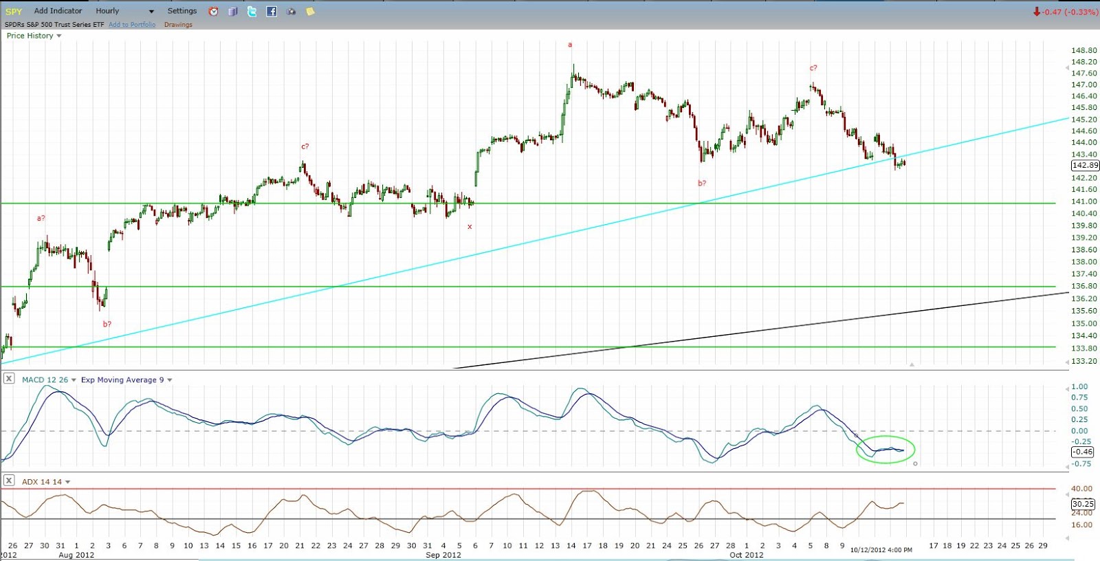
See the chart for notes.  The Dow (and other indexes) is in a potentially explosive downside position.  Using a "stop" order to short on a break below last week's low may be the best strategy in this case.  A stop would be placed above the highs of the rebound off of last week's low.

Of note, but not shown here, there has been a dearth of "smart money" buying occurring over the last week or two compared to the buying that occurred at the June low.  So with the market at obvious trendline/chart pattern support, the smart money is not buying aggressively.  This is suggestive to me that a downside continuation will occur, and probably sooner rather than later.  The next obvious chart support is the June low if a sharp breakdown does occur.

Click on Chart to Enlarge

If the SPY is at a new corrective low by Tuesday afternoon, that keeps the shorter-term price logic clearly down.  So again, entering short (if triggered by Tuesday) on a stop below last week's lows would be my preferred strategy.

The hourly MACD crossed into a sell Friday afternoon.  Since the Sept high, these signals have been good indications of renewed selling and have not developed divergence prior to price move to new lows.  That is typical behavior of a trending type move.  So again, a quick move to new lows would be further indication of a predominant downward price psychology.

While the markets may seem oversold, it is important to consider multiple time frames.  While the daily time frame reading are nearing typical oversold readings, intermediate sentiment readings are not yet at a point that screams of an imminent rebound.  And weekly, monthly, and quarterly indicators all are overbought and turning down.  The weekly stochastics and MACD indicators are not oversold at this point. In fact the weekly MACD has just crosssed down after a bearish divergence, which is typical indication of a larger degree trend change and impending sizable move.  So understand that there is plenty of room to the downside here for prices.


Sunday, October 14, 2012

LONG TERM MARKET OUTLOOK UPDATE - Larger Currents Turning Down, But Short-Term Oversold

Click on Chart to Enlarge

The monthly stochastics on the SPY is now in a bearish divergence in overbought territory suggesting a possible major high completing.  In addition to the weekly MACD bearish divergence, the stage is certainly set for a possible major correction of the bull market, or an outright bear market.  IF a bear market is beginning, then there are two distinct possibilities for future price action to logically CONFIRM that is the case.  

1.  The first would be for the entire move up since the June 2012 low to be completely retraced in less time than it took to form.  
2.  The second would be for a decline, then a rally to a lower high, followed by a move that completely retraces THAT rally in less time than it took to form.

Click on Chart to Enlarge

The weekly stochastics on SPY is now pointing down from overbought and has triggered a 1 bar trailing low sell signal on the weekly time frame.  See the recent video for further detail on that set-up.  This again suggests that we may see several more weeks of downside before the selling pressure is overdone.

Click on Chart to Enlarge

The hourly MACD chart is oversold with mild BULLish divergence at this point suggesting a short-term (multi-day) rally may be likely.  HOWEVER, with the larger currents turning down, my guess is that the rally may be dampened, and be more of a sideways chop or consolidation for a few days before a break to lower corrective lows.  Also, apparent on the hourly chart is logical confirmation of a downward pattern beginning because the recent rally was completely retraced in less time than it took to form.  It will take a move basically to new highs in 5-6 days to shift the price logic back to upwards on the daily time frame.

Click on Chart to Enlarge

A 7 legged pattern may be completing to finalize this bull market.  CoT major sell signals are noted at the major highs of the pattern along the way.  Again confirmation is needed by a move below the June lows in less time than the rally took to offer logical PROOF that the bull market is likely complete.

Of note on this chart are the red trendlines which were the prevailing uptrend lines for the bull market at the time of the intermediate highs in this bull market.  Notice that in both 2010 and 2011, the initial break was somewhat sharp but short-lived, followed by a test of the trendline from the underside before continuing down to lower lows.  In the current case, the trendline is less steep, and there is more room underneath the market before the trendline is touched or exceeded.  So, it is possible that the current decline is relatively large and sharp and does undercut the June low on the initial trendline break.  Then that may be followed by a back test of the current uptrend line before continuation downward.

Click on Chart to Enlarge

The is a quarterly chart of the Dow 30 going back to 1915.  A couple points of note here.

1.  The stochastics is overbought AT A LOWER HIGH currently, which has only happened 2 times in the 100 years seen on the chart.  Both times the market underwent substantial downside with a down/sideways market for 5-6 years before sustained upward momentum again.

2.  The dark red upper boundary line from the highs of the 1930's and 1960's highs, acted as support at the 2002 lows, then once it was breached after an initial mild rebound attempt in Sept 2008, the major "crash of 2008" occurred.  Since then, price has rallied to touch the underside of the trendline twice in 2012 both times leading to corrections.  And price is currently just underneath the line at the recent high.  So this may be a broken support that is now resistance and lead to a major correction.

3.  Notice the general "head and shoulders" top formation on the chart from 2000 to 2012 if the rally were to complete here.  The S&P 500 is similar with a triple top look.  While it would be hard to imagine the fulfillment of such a pattern on an arithmetic basis, especially given the downsloping neckline, completion of the chart-based target on a logarithmic projection would put the Dow at about 2600 several years down the road.

Click on Chart to Enlarge

This is a monthly chart of the S&P 500 going back to the 1970's.  There are a couple interesting features here.

1.  The green lines represent projections of the well know 4 year "presidential" cycle lows in stocks aligning at the 2002 and 1998 lows, then projected both forward and backward (1 is missing at the fall 1990 low).  Of note by the blue circle around the current time frame, in Oct 2012 we are exactly half way between the projected lows, suggesting we are entering the downside portion of the cycle now.

2.  The next cycle low projects to fall of 2014.  My study of this cycle suggests a tendency for the final 1/5 of the cycle (roughly) to be the most bearish portion of the cycle.  That would be from the beginning of 2014 until the projected low in this case.  So we may be topping here, but still a ways away from the worst of it if a bear market is beginning.

Click on Chart to Enlarge

Now this last chart may be the most telling, the most "beautiful" in cyclical terms, and may be one of the least know types of analysis you will hear in technical analysis circles.  See the chart for notes....but here is a summary.

-Since 2000 there is the potential for a continuing 7 year HIGH-HIGH-LOW cycle which also projects the next 7 year low in fall (October) 2014.
-There is a potential 5 year LOW-HIGH-HIGH cycle topping this month (Oct 2012), suggesting downside from here.
-There are 1/2 harmonic sub-components of both cycles present in the intervening bear and bull markets with a 3.5 year bull market from March 2009 to Sept 2012, and a 2.5 year bear market from March 2000 to Oct 2002.


I hope this post has been instructive for the larger picture going on here.  My take is decidedly bearish from this point forward in stocks for the next couple years given all the evidence presented here.


Wednesday, October 10, 2012

Stock Market and AAPL Update

10-9-12 Market Update

Check out the video for detailed analysis on AAPL and the general markets.  I expect further correction in stocks from these levels, with a possibly major topping process in the works.

Monday, October 1, 2012

Multi Market Update

9-29-12 Market Update

The video covers stocks, bonds, gold, oil, CoT data, AAPL.  Tighten stop or exit long equity holdings.

Thursday, August 9, 2012

Stocks and Gold Video Update

Click on Chart to Enlarge

Major price highs likely near in stocks and gold.  Bearish divergences are all over the place, and volume is at multi year lows.  AAPL likely set to break down from a failed base pattern.

Saturday, August 4, 2012

Longer Term Investment Outlook

Click on Chart to Enlarge

This video contains charts and some further details regarding stocks and bonds specifically.  The outlook and advice is pretty simple.  Sell all bonds and move to cash.  Understand that after the 2008 stock market decline, big money has flowed to bonds and that is the class of assets that your investment adviser or financial planner will currently feel safe recommending and be able to show you that has positive returns over the last few years.  But as investors, we have to be savvy and see the risk or potential BEFORE it actually happens, and be willing to act with little to no confirmation from FACT that we have chosen correctly.  THIS IS ONE OF THOSE TIMES.

Additionally the smart money commercial stock futures traders took a big jump in selling this according to the CoT data, and I think we will see that they sold even more heavily through this past week's jobs/unemployment data.  My suggestion is again to sell stocks and move to cash.  The pattern and real money data are becoming increasingly clear that a major market movement is about to take place to the downside.  If you need some initial PROOF, then I suggest that a daily close below 1310 on the S&P 500 be your signal that this current bull market is over, and we will see a rapid price decline.

Again this is investment time frame advice.  So understand that while I think that we truly are very close to seeing a major market shift to the downside and unwinding of some of the "bubble" activity in stocks and bonds, it may be 2-4 years for things to really play before possibly re-investing in a major way.

Tuesday, July 31, 2012

Market Update - Pattern Analysis

Click on Chart to Enlarge

This chart contains a few things of interest.  This is the NYSE, though similar comments could apply for other indexes.

The green box is what I would consider an ideal projection for the end of the current wave up if the pattern up since the Oct 2011 low is an ABCDE pattern - a type of contracting triangle, but with a D wave that is larger than B.  This would imply a small upside potential from current levels of about 2%, with the time to complete being mid next week.

Secondarily, the ABC labels and the blue and pink lines project a harmonic pattern up from the June low.  One of the most common patterns is the ABC pattern where the price of C = the price of A.  The blue lines project that pattern which would be at 8060ish which is about 2% higher from here.

Now another common variation of a harmonic ABC pattern is for the "c" portion to be a smaller abc pattern itself.  So there is an abc within an ABC.  That is what the pink lines project.  The smaller abc would complete at 8000 which is about 1.5% above current levels.

So with these different forms of pattern analysis, we can arrive at a fairly tight resistance zone at the NYSE 8060 level.

This is also in conjunction with a technical picture showing daily time frame bearish divergence and weekly stochastics nearly bought.  So I am watching that level as a prime area for a downside reversal.  But a breakout with a large candlestick or gap through that zone would be a likely sign of a continuing uptrend.

Hourly chart indicators are overbought but without solid bearish divergence.  I think we may see some divergence develop before a possible pullback.  I am anticipating a short/inverse trade opportunity within the next week.

Wednesday, July 18, 2012

Market Update - Stocks, Gold, Bonds

Market Update 7-17-12

Check out the video for chart patterns and indicators that are informative for the directions of stocks, gold, and US bonds.