
Click on Chart to Enlarge
The monthly stochastics on the SPY is now in a bearish divergence in overbought territory suggesting a possible major high completing. In addition to the weekly MACD bearish divergence, the stage is certainly set for a possible major correction of the bull market, or an outright bear market. IF a bear market is beginning, then there are two distinct possibilities for future price action to logically CONFIRM that is the case.
1. The first would be for the entire move up since the June 2012 low to be completely retraced in less time than it took to form.
2. The second would be for a decline, then a rally to a lower high, followed by a move that completely retraces THAT rally in less time than it took to form.

The weekly stochastics on SPY is now pointing down from overbought and has triggered a 1 bar trailing low sell signal on the weekly time frame. See the recent video for further detail on that set-up. This again suggests that we may see several more weeks of downside before the selling pressure is overdone.
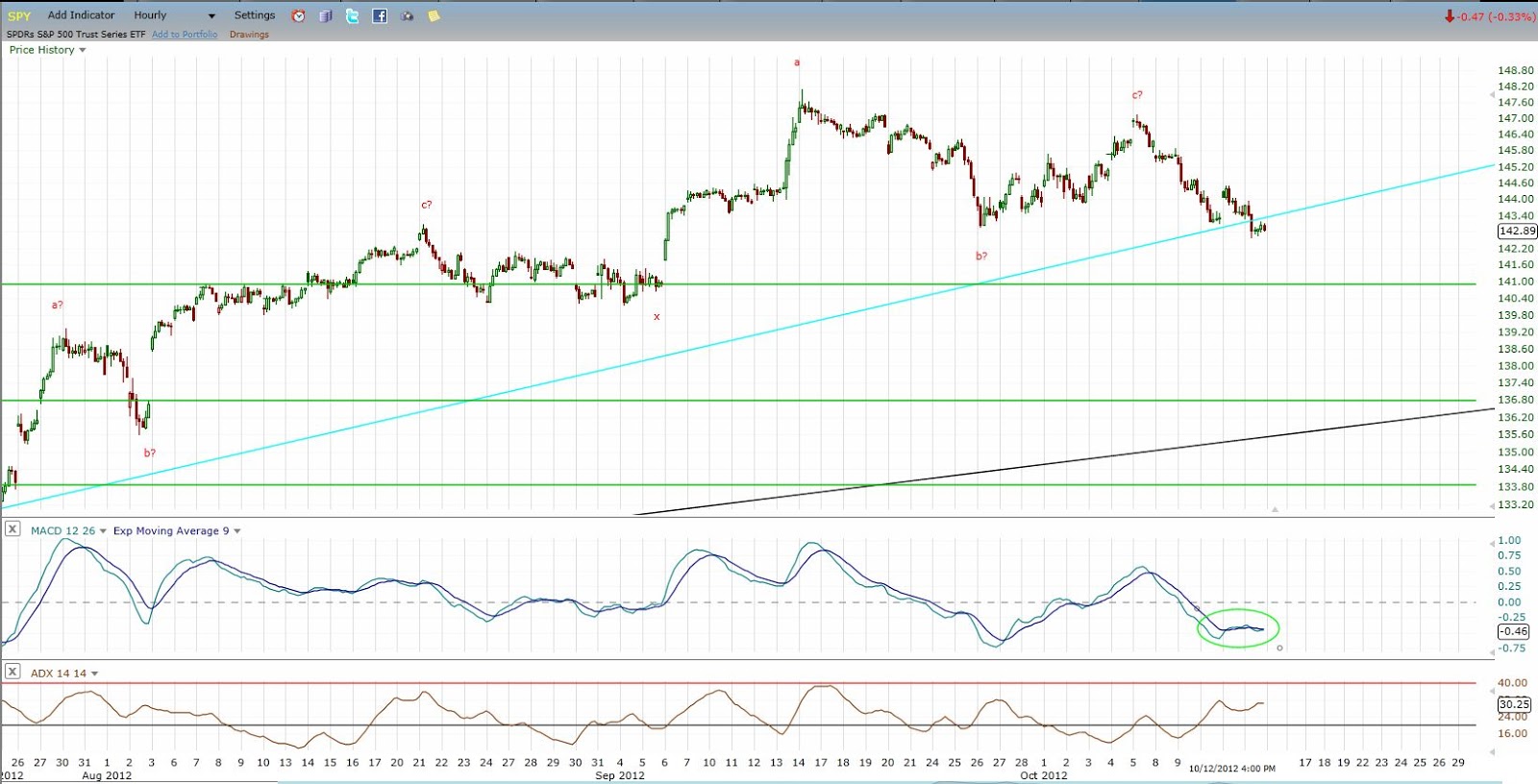
Click on Chart to Enlarge
The hourly MACD chart is oversold with mild BULLish divergence at this point suggesting a short-term (multi-day) rally may be likely. HOWEVER, with the larger currents turning down, my guess is that the rally may be dampened, and be more of a sideways chop or consolidation for a few days before a break to lower corrective lows. Also, apparent on the hourly chart is logical confirmation of a downward pattern beginning because the recent rally was completely retraced in less time than it took to form. It will take a move basically to new highs in 5-6 days to shift the price logic back to upwards on the daily time frame.

Click on Chart to Enlarge
A 7 legged pattern may be completing to finalize this bull market. CoT major sell signals are noted at the major highs of the pattern along the way. Again confirmation is needed by a move below the June lows in less time than the rally took to offer logical PROOF that the bull market is likely complete.
Of note on this chart are the red trendlines which were the prevailing uptrend lines for the bull market at the time of the intermediate highs in this bull market. Notice that in both 2010 and 2011, the initial break was somewhat sharp but short-lived, followed by a test of the trendline from the underside before continuing down to lower lows. In the current case, the trendline is less steep, and there is more room underneath the market before the trendline is touched or exceeded. So, it is possible that the current decline is relatively large and sharp and does undercut the June low on the initial trendline break. Then that may be followed by a back test of the current uptrend line before continuation downward.

Click on Chart to Enlarge
The is a quarterly chart of the Dow 30 going back to 1915. A couple points of note here.
1. The stochastics is overbought AT A LOWER HIGH currently, which has only happened 2 times in the 100 years seen on the chart. Both times the market underwent substantial downside with a down/sideways market for 5-6 years before sustained upward momentum again.
2. The dark red upper boundary line from the highs of the 1930's and 1960's highs, acted as support at the 2002 lows, then once it was breached after an initial mild rebound attempt in Sept 2008, the major "crash of 2008" occurred. Since then, price has rallied to touch the underside of the trendline twice in 2012 both times leading to corrections. And price is currently just underneath the line at the recent high. So this may be a broken support that is now resistance and lead to a major correction.
3. Notice the general "head and shoulders" top formation on the chart from 2000 to 2012 if the rally were to complete here. The S&P 500 is similar with a triple top look. While it would be hard to imagine the fulfillment of such a pattern on an arithmetic basis, especially given the downsloping neckline, completion of the chart-based target on a logarithmic projection would put the Dow at about 2600 several years down the road.

Click on Chart to Enlarge
This is a monthly chart of the S&P 500 going back to the 1970's. There are a couple interesting features here.
1. The green lines represent projections of the well know 4 year "presidential" cycle lows in stocks aligning at the 2002 and 1998 lows, then projected both forward and backward (1 is missing at the fall 1990 low). Of note by the blue circle around the current time frame, in Oct 2012 we are exactly half way between the projected lows, suggesting we are entering the downside portion of the cycle now.
2. The next cycle low projects to fall of 2014. My study of this cycle suggests a tendency for the final 1/5 of the cycle (roughly) to be the most bearish portion of the cycle. That would be from the beginning of 2014 until the projected low in this case. So we may be topping here, but still a ways away from the worst of it if a bear market is beginning.

Click on Chart to Enlarge
Now this last chart may be the most telling, the most "beautiful" in cyclical terms, and may be one of the least know types of analysis you will hear in technical analysis circles. See the chart for notes....but here is a summary.
-Since 2000 there is the potential for a continuing 7 year HIGH-HIGH-LOW cycle which also projects the next 7 year low in fall (October) 2014.
-There is a potential 5 year LOW-HIGH-HIGH cycle topping this month (Oct 2012), suggesting downside from here.
-There are 1/2 harmonic sub-components of both cycles present in the intervening bear and bull markets with a 3.5 year bull market from March 2009 to Sept 2012, and a 2.5 year bear market from March 2000 to Oct 2002.
I hope this post has been instructive for the larger picture going on here. My take is decidedly bearish from this point forward in stocks for the next couple years given all the evidence presented here.


