Showing posts with label divergence. Show all posts

Thursday, February 9, 2017

Put/Call Ratio Analysis Helps to Identify Stock Price Tops and Bottoms

Click on Chart to Enlarge

The chart above is a slightly different version of one I have shown many times over the past several years.  This chart is a 7 day average of the total put/call ratio with some standard deviation bands around it.

The interpretation of the chart is pretty standard for technical analysis.  I like following this data because it is not looking at price.  It looks at a measure of underlying "sentiment" as evidenced by large scale options transactions.  So price is an effect of other underlying causes in the crowd.

I have made a mental construct over the years which likens the movement of market prices to physical movement.  Once a direction is set, there is an inertia, and other than UFOs, we typically see a process of slowing or momentum changing prior to a shift in direction of the object.

That "slowing" before a change of direction is evidenced by divergences.  So we have a situation where the direction of the market in this case is still "up", but the put call ratio is showing a marked divergence indicating that the underlying sentiment or driver of prices higher is actually slowing down.

As noted on the chart with red and green lines, the general idea here is to look for an extreme data reading, outside the bollinger bands indicating that the trend may not be sustained at that rate.  These extreme points are typically NOT final highs or lows.  The actual end of a move, will most often occur after a divergence develops, with new price extremes, but often markedly non-confirming put/call ratio readings.  And the reading at the end of the move are usually well within the deviation bands, and so do not appear significant on their own.

My point here is to give a little perspective but to make note of the classic divergence pattern here in the sentiment which has put me on alert that we are near the end of this rally since November.  And we are likely to see at least a minor correction occur of the uptrend.  It has been ~2 months since the extreme reading in the put/call ratio occurred.  And my observation of this types of divergences is that a trend often persists for several weeks after the extreme before a final price high or low.  If I had to make a guestimate of the average, it would be about 6 weeks.  So here we are at about 8 weeks since the extreme, and I believe that markets are likely to peak any day now.


Pete

Tuesday, March 17, 2015

Ending Diagonal In the S&P 500 Possible

Ending Diagonal In the S&P 500 Possible

This technical analysis video of the S&P 500 and the total put/call ratio displays a possible ending diagonal pattern forming since the October 2014 low.  It cannot be confirmed yet, but the first 4 out of the 5 waves of the pattern are potentially complete.  Ending diagonals MUST be followed by explosive reversals in price action as the video details.  If not, then the pattern is not really and ending diagonal.  An ending diagonal ENDS a major market move, and then price will explosively move in the other direction.

There is an FOMC announcement tomorrow which may lead to a market reaction.  Currently my expectation is for a rally into the end of the month.  Beware a breakout of the February high.  If a move to new highs occurs with broad scoped divergences in breadth, price, volatility, put/call ratios, and other sentiment measures, and a bearish top reversal candlestick forms around or below the upper boundary of the wedge, it could offer a great short selling opportunity for stocks.  

I will update as price action unfolds here in the coming weeks.

Tuesday, January 6, 2015

Stock Market and Index Option Update

If you are holding or purchased any put options on the US stock indexes at my recent post about the sell warning, then the corresponding options I noted or something similar would be up over 100% currently.

At this time, the question may be whether to hold any portion of the position.

There is currently no bullish divergence pattern on the hourly MACD of SPY, and neither is there a bullish pattern as of yet on my personal trading algorithms which I use to identify bottom reversals in the markets.

So at this time it may be sensible to continue to hold part or all of a put option on the indexes.

If there are any questions or scenarios regarding this then comment or email reply and I will try to assist you.

Pete

Thursday, December 11, 2014

Short Term Stock Market Update

So far on this small decline the last few days, there has not developed a bullish divergence of the type that typically leads to a bottom.  So I expect at least modest further declines here.  My general feeling is that stocks will continue to move at least modestly lower into next week's FOMC announcement at which point the stage may be set for a bounce from oversold conditions at least temporarily.

I may post signals of my personal trading system if any are generated in the next few days.

Also I would like to get a post up regarding some longer term cycles at play here.  But in short the 5th year of a decade, and the current portion of the presidential cycle are both historically bullish.  So while the technical aspect of the market is once again at a multiple time frame bearish divergence indicating a probable correction or consolidation, if prices break to yet higher highs later this month or into next year, it may be that price will enter a very directional period of market gains.

But without getting too far ahead of our selves, the first thing to watch for at this point is a daily reversal bar and also the development of shorter time frame bullish divergences (hourly, 30 min, etc) on SPY or other index ETFs.


Thursday, November 6, 2014

Gold and Stock Market Update

As of today, 11-6-14 both gold and silver have triple time frame MACD bullish divergences on the weekly, daily, and hourly charts.  So I am keeping a close eye on them for bullish reversals in the price action.  Any daily reversal candlestick pattern could be used as entry.  Or an hourly chart breakout/momentum signal could be used as well.  In these types of cases, assuming a buy signal is given, the stop is placed below the low, and then a portion of the trade is exited by using the hourly chart to give stop movement and/or exit signals.  Then a portion is held using the daily chart for signals.  I have given ideas on how to trail stops using MACD or moving average channels in the past.

Also for the US stocks, the hourly chart bearish divergence is pretty mature right now, so we are probably very close to a short term pullback in stocks.  However, given the strength of the rally and no divergence on the daily chart, it seems unlikely to me that a top of major significance could be made until at least a couple more weeks pass and some daily time frame momentum begins to show divergence.

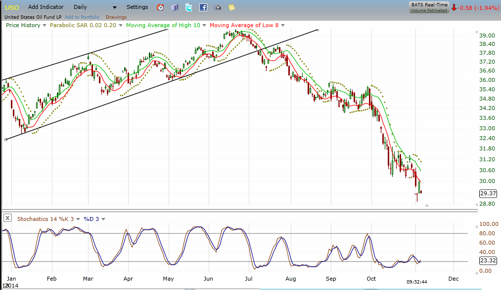
Also USO/oil prices are showing a very nice daily/weekly dual time frame stochastics set-up today for a long trade.  Weekly stochastics is oversold.  And the daily is oversold with bullish divergence and made a bullish reversal yesterday.  A move above yesterday's high in USO would be a buy signal with a stop below the lowest point of this decline.  A currently have an order in UCO to go long on a move above yesterday's high.

Click Chart to Enlarge

This is USO daily chart showing the stochastics below which has bullish divergence.  Multiple commodity markets have the underlying technical and smart money sentiment to stage major rallies.

Thursday, October 23, 2014

First Signs of Divergence on This Rally - SPY 10-23-14


Click on Charts to Enlarge

These are hourly charts of SPY and the VIX.  They are actually now showing a reasonable divergence pattern to set up a short trade.  However there are relatively mixed currents of momentum on the different time frames which suggests to me that we are likely to see continued trading mostly within the range of the last 6 trading days for probably a few weeks to come.

Of note on the charts are the divergence in the momentum indicator relative to SPY.  And on the lower chart, the VIX did not confirm a lower low this afternoon as SPY made a higher high.  These VIX non-confirmations are often leading indicators of a reversal attempt.

Not shown is the hourly total put/call ratio chart which nearly touched the bottom bollinger band this afternoon and is further indication that this move is now stretched to the upside for the short term.

That being said there is no downside breakout on this hourly chart to suggest that a significant move is underway.

After similar sell-offs to the recent October plunge, the sharpest portion of the rebounds have occurred in the first few days, likely as short-covering rallies.  Once that initial short-covering is exhausted, we will likely see at least a 1-2 day pullback, possibly quite sharp.  However, a subsequent move to yet higher closing highs, would be indicative of legitimate market interest on the long side in my estimation.

Friday, August 8, 2014

Interesting Overnight Action In Stock Futures

Click on Chart to Enlarge

The short term reversal signal I highlighted Wednesday, did not amount to much.  And yet the set-up remains here that there is divergence in sentiment (also divergence in short term price action/technicals) as prices are making lower lows.

Last night the futures ran down nearly a percent on a headline "negative" news item with US ordering air strikes on Iraq and further conflict news out of Europe.  But here we are in the morning with the overnight losses recovered and a possible hammer candlestick (at least as it appears now).

So stocks look set-up to actually make a small gap up today.  But given the over night lower lows in the futures and yesterday's weak close, I would suggest that we are likely to see price move below yesterday's session low after a gap opening, but with a reasonably good chance that a rally occurs after breaking yesterday's low in the cash session.

This set-up may be most useful for day traders, to try to time a bottom reversal off a 1 or 5 min chart, with the possibility of a rally to close in the upper end of the daily range.

Thursday, July 18, 2013

Stock Market Topping?

Stock Market Topping?

Multiple time frame analysis indicates stocks could be making an intermediate to long term high here.

This video covers a multiple time frame technical analysis of the MACD indicator on SPY.  What is apparent is that there is a condition of extreme overbought with divergence on multiple time frame which indicates that we may be approaching a longer term peak in stocks here.

I also give some ideas on what specific indicator signals to use to actually go about entering a possible short position if we see the market correct from these levels.


Tuesday, July 16, 2013

Nearing Another Possible Large Scale Pattern Completion

This post will be somewhat of a follow up to my early 2013 stock market forecast and its follow up as stocks broke out to the upside on the first trading day of January 2013.  At that time based on the market pattern I thought that a pattern could be completing and laid out in the forecast post the price action criteria that would need to be met to provide some early confirmation that the outlook was correct.  That type of price action never came and instead we saw a forceful upward move.

There is much folly I think in creating market forecasts, yet many traders and market analysts continue to do so.  I think a good market analyst is actually behaving in a scientific manner by making a forecast.  Essentially they have a theory or hypothesis of market movement and so they create an expectation based on that hypothesis.  I think that is excellent for building confidence in market analysis and trading decisions.  But the idea of objective confirming price action is a critical component as well, and if you follow any consistently good market timers or traders who make forecasts, they basically all have criteria that help to confirm the unfolding of a forecast or that quickly call a forecast into question.  This is precisely why I use price and time criteria for confirmation in conjunction with patterns.  It helps to keep somewhat patient in waiting for price to actually do what is expected, but also can still get you in early enough to make good profits.  At times I also feel that patterns can be clear enough that they give the opportunity to take calculated risk even before confirmation occurs.

Obviously since that early 2013 time we saw the bull market continue without any major corrections along the way, affirming that indeed the move up in early 2013 was a "breakout" in that it started a new price pattern and phase of market psychology to the upside.

Now at this point it appears from technical analysis and sentiment that we may be on the other side of that equation, and are nearing a possible large scale pattern completion, at least of the pattern up since Nov 2012, and possibly also of either the move up since Oct 2011 or the entire bull market since 2009.  Based on the logical concepts I use to track pattern formation, I think that it is possible we are entering the peak price area for this bull market, but it appears that the entire bull market price pattern could either end at a lower high next year or even experience a major correction, followed by another sustained bullish advance to new bull market highs into the more typical 6th or 7th year of the decade which are the most common historical topping years for bull markets.

Click on Chart to Enlarge

I do feel that I have some legs to stand on in tracking market patterns in that I highlighted in advance both the price high pattern completions at the April 2010 and May-July 2011 market highs.  See the posts below for the posts I created at those times.  In both cases I remember as I wrote them that it felt a little absurd to suggest major corrections at those times.  And in the current market environment I feel the same because the broad markets are at new all time highs yet again.

http://stockmarketalchemy.blogspot.com/2010/05/possible-major-pattern-completion-in.html

http://stockmarketalchemy.blogspot.com/2011/07/possible-completion-of-flat-pattern.html
http://stockmarketalchemy.blogspot.com/2011/07/possible-confirmation-of-new-downward.html
http://stockmarketalchemy.blogspot.com/2011/08/end-of-initial-plunge.html

-Now in order to provide confirmation that a pattern is completing what will need to see for the move up since June to now to be completely retraced in less time than it took to form.  

The red box on the chart above is the expected topping area for this rally based on pattern trend lines and time relations.  The specific date range is July 16th to August 14th.  At this time it appears likely that we could see a mild pullback followed by a push to new high or to test the highs but create a lower swing high.

As an initial stage of confirmation that a top may be in place, we would like to see the trend line of the move up since June broken.  At this point the structure looks somewhat incomplete on the short term charts, and it would be nice to see a pullback and lower high to give us a different trend line and set of swing highs and lows to work with to more specifically track the price logic here.  Basically the confirmation of a pattern completion comes when the subsequent price action completely retraces the most recent trending move in LESS TIME than it took to form.

Click on Chart to Enlarge

This is a weekly chart of the S&P 500 showing the MACD underneath.  What is very obvious from the chart is that the MACD is in the "overbought" region compared to past highs.  In fact, its recent high is the highest level it has reached going back through both this bull market AND the 2002-2007 bull market.  So we certainly are justified in being cautious here.  Now also noted on the chart on some red lines on the MACD showing divergence patterns, which are where prices makes a higher high but the MACD makes a lower high.  Weekly time frame divergences have consistently led to corrections in the last 2 bull markets. Currently as price is pushing back to new bull market highs, we have a divergence pattern setting up with the MACD at extreme overbought levels.  So we are potentially set up for a failed breakout of the May highs based on this indicator pattern.

Click on Chart to Enlarge

This is a monthly time frame chart showing labeling of a potential continually unfolding expanding triangle pattern since the 2000 highs.  That would imply that there is a coming bear market of historic proportions that would likely take price below the 2009 lows in the S&P 500.

Just for the sake of analysis, let's say we are coming to a bull market high here this summer.  Then based on the time of the last 2 bear markets we may expect the coming bear market to last about 2 years, which is about half the total time of the last 2 bear markets combined.

The red rectangle on this chart represents what I would anticipate to be the time of greatest risk of a major decline based on multiple cycle analysis that I covered in October of last year.  That time frame will be the conjunction of three potentially important cycle lows:

1) The 4 year/Presidential cycle due in Oct 2014
2) The annual cycle weakness into the Sept/Oct time frame
3) The projected low for a 7 year HIGH-HIGH-LOW sequence starting from the 2000 bull market high.

If the bull market is completing here, the chart above has some projections of what we may expect to follow.  We may see an immediate decline that is larger and faster than any in the bull market to date.  Or we may see a larger and more time consuming correction that does not retrace the most recent leg up in less time than it took to form and is not FASTER than the prior declines like the major correction in 2011.  In the second case we would be more likely to experience a rebound/retest of the old highs, which would give the classic low risk shorting opportunity and the first bear market rebound is completing.

Given the typical annual cycle weakness into the fall and strength into the spring, we may expect weakness into this fall followed by a rebound into next spring before the major downside portion of these cycles really kicks in.  Again this is all IF we are completing a bull market high in the current near term.

So let's watch as the action unfolds here.  I will also update with the typical breakout buy pattern to look for if the bull is to continue.


Monday, November 19, 2012

AAPL Chart Analysis - Probable Rebound Attempt Coming

Click on Chart to Enlarge

As I have detailed repeatedly in recent posts, the initial target for AAPL on this move down off the fall high was the low of the previous base around the $525 level.  On Friday we saw a big swoon below that level on high volume followed by a reversal to close above the old base low.

The candlestick was a very high volume and wide ranging hammer type candlestick.  It is not uncommon for an immediate reversal higher after a break of a major low like that.  Understand what is going on in the market at that point......Obviously many standing sell stop orders would be placed below that low based on chart support for the major uptrend.  So the market will typically push through those points where many orders accumulate to "wash out" the stops before reversing.  And obviously there will be some smart money placing orders to buy just under or at where those last ditch stop orders were placed.

So the bulls took control and pushed the stock higher.  Given that the markets are oversold on the daily chart time frame, I think we may see a multi day rally attempt from this point in the general market averages.

But in the case of AAPL, if the stock does rally from here but later fails and breaks to new lows, that would be a major failure for the stock and may lead to a continuation down.  On a short-term note, those wide range hammer candlesticks have about a 60% probability of future prices moving BELOW the mid point of the tail on the hammer even if the reversal holds.  Given the possibility of a significant rebound attempt in the stock, a set up like that can be followed intraday as prices move back into the tail region and then any upside reversal signals can be taken as long trades and often create an outstanding reward/risk opportunity.

When stocks that are heavily owed by institutions (as AAPL obviously is) top out, they can lead to some sloppy price action and volatile, choppy price moves as the topping process unfolds.

The general markets are not yet showing the typical bullish divergence on a daily frame that is typical of most corrective bottoms.  So I think we may be in store for a rally attempt for several days, followed by new corrective lows before a possible more sustained advance or rally attempt.

If you would like to learn more about the market forecasting techniques that I use to consistently pinpoint market turns and trend changes, then fill out the form on the right side of the page to receive my free stock trading video course, or click on the link above.

Friday, November 9, 2012

Short-Term Oversold, But No Divergence

Click on Chart to Enlarge

The hourly chart of SPY is oversold and the MACD making a bullish cross as I type this.  The daily chart shows prices have been touching the lower bollinger band for a few days indicating that prices are stretched to the downside.  However, there is no bullish divergence on the MACD even at the 30 min time frame, which calls into question whether this move down is bottoming for a major rebound attempt.

The chart above is the VIX/VXV which is shorter term volatility divided by longer term volatility.  In general the shorter term (VIX) should be lower creating a VIX/VXV ratio that is less than 1.0 (indicated by the green line).  However, there are times when the VIX gets higher than VXV.  That usually indicates a point of intermediate term panic in the market and leads to a rebound pretty soon.  The market is out of balance under that condition.

Currently the ratio is not quite at 1.0 yet.  I have been watching this indicator to help pinpoint an upcoming rally attempt.  Of note is that the ratio is higher than it was at the June 2012 low which did not even reach 1.0. 

If it does move above the 1.0 level, I would expect a tradable bottom to occur soon after.  There is no guarantee that it will reach that level before a major rally attempt, and with prices oversold on the daily time frame, I think this is a time to protect open short positions by tightening stops or exiting on appropriate technical signals.


Thursday, August 9, 2012

Stocks and Gold Video Update

Click on Chart to Enlarge

Major price highs likely near in stocks and gold.  Bearish divergences are all over the place, and volume is at multi year lows.  AAPL likely set to break down from a failed base pattern.